BRANDING
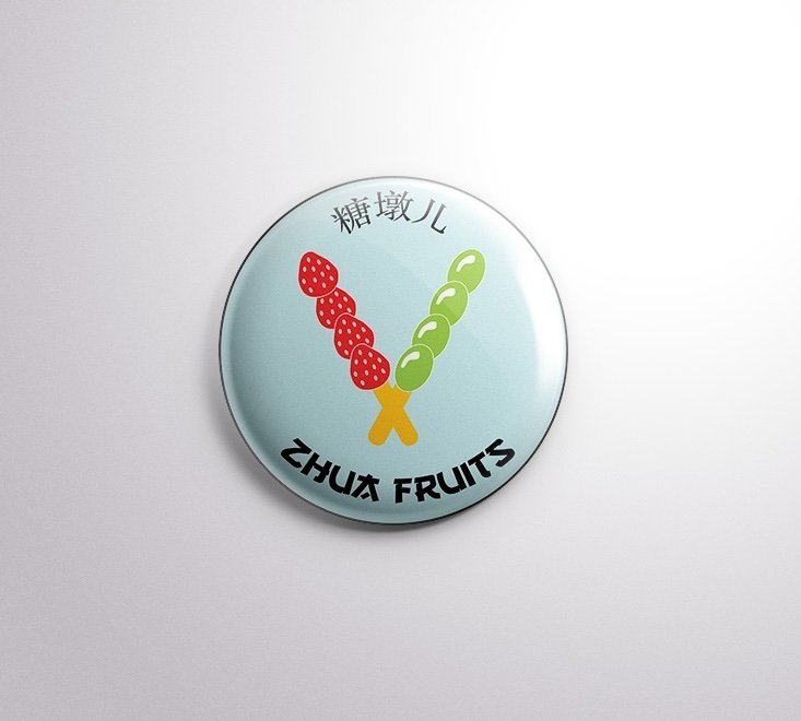
Zhua fruits logo design
Ever since I got into the Asian culture of both food and entertainment, I had a bucket list of what I should try, and what I should, this project defines my top food to try, Tang Hulu. Many people know that Tang Hulu is basically sugar-coated fruit, but I bet you didn't know that the structure of this snack is no joke!
Tools:


The purpose of this project is to create a new logo from scratch for a new snack shop for Asian desserts and snacks, making Tang Hulu their famous snack. This is a personal project inspired by this famous snack as it was my very first time trying it after so long. Three weeks ago, I wanted to try Tang Hulu after promising myself to do so years ago; I went all the way to Chinatown for this snack. After trying it, I was so impressed by its structure and its taste, that I wanted to make a logo for a business like this as I am someone who personally love Asian snacks.
purpose
My plan for this project is to incorporate at least two Chinese elements into this design, not including the Tang Hulu.
design strategy
Typography
I am going to use two different fonts as some of them, including from my FontBook cannot change the style of the Chinese translation. So my main font for the logo is going to be with an almost Asian style text, like the style you see in Fruit Ninja; this font is called “Gang Of Three”. The font for the Chinese translation of “Tang Hulu” will remain as the Arial font as this was the only typeface that could apply to foreign writing.
Why I Think This Final Design Was Successful
I made this logo as soon as I got the idea after having that “first-time” experience trying this snack, and using that kind of inspiration is almost rare for me when doing projects. When making projects on my own, it’s hard to come across ideas or the inspiration I need to make them; concluding this project, along with the Kamen Rider poster I made as well, to be successful is a well known fact because these two are made from my stronger interests since before I started graphic design.
design challenges
I did my research on businesses that serve Asian snacks and/or logo designs resembling what Tang Hulu is, and my biggest goal was to take what I know about it and sketch it myself, especially making my own logo name bc it bothers me to use big and obvious details from designs I have researched and apply it to mine otherwise it would look like cheating, so I challenged myself and did it on my own. I concluded my design look to include the two sticks of fruit and the typography with an font that resembles its Asian culture. The typography was the hardest for this design because there are so many collections of fonts that resemble different styles of Asian culture, and I needed only one of the many fonts I had from these collections because I did not want to combine two identical styles.
additional content