BRANDING/PACKAGE DESIGN
Witness the creation of the Aroma Cabin candles, made from a combination of pure essential oils, can not only enlighten any room but also blend it with relaxing smells to create a peaceful atmosphere in any environment.
Aroma cabin candle packaging
Tools:


purpose
The purpose of this project is to establish candle packaging that exemplifies the brand, Aroma Cabin, and the ingredients used for aromatherapy. Additionally, I aim to keep this design as simplistic as possible as the material is clear/matte. I also intend to create a couple of promotional materials and a designed landing page to expand this project a bit more.
The Logo
Before designing the actual packaging for this candle, I needed a logo. Originally, I was going to use the Zhua Fruits logo and make it look like it is a limited edition item for a special event, but it did not bond well as the idea behind this packaging are candle made with natural essential oils, or plant-based oils that help with insomnia and other purposes. Since the concept I finalized was going to aromatherapy, I concluded with the name "Aroma Cabin" with a candle and the aroma icon as the wick.
Typography
I wanted to avoid using Montserrat in this project, even though it is my favourite :) But I wanted to use a similar font, so I had to choose between Futura and Poppins. After experimenting, I finalized on Futura with the style Demi to make it less bold than the average bold style. I manipulated the spacing between the letters to align them better on both the logo word mark and the written details since it looked tight.
Design layout
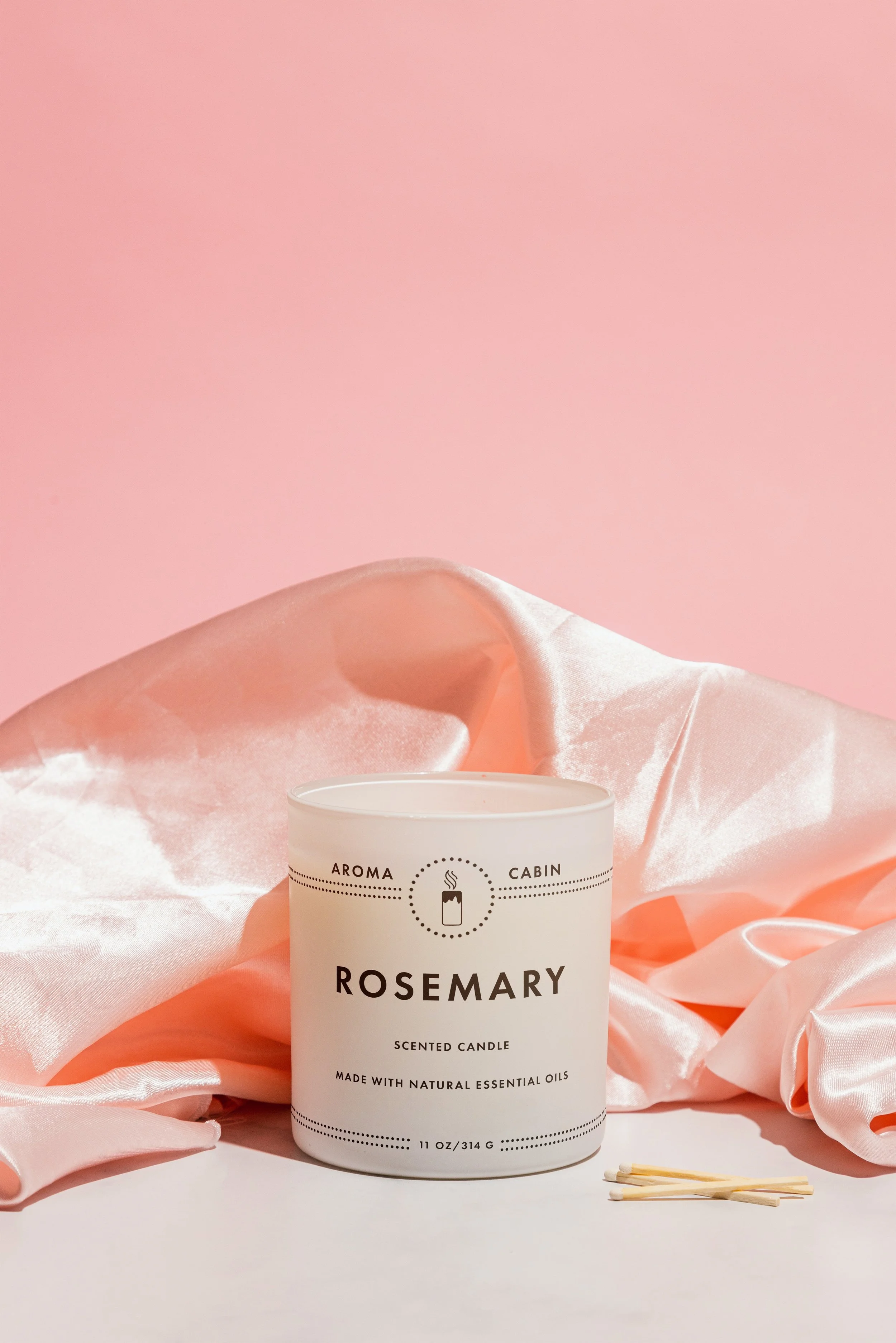
I wanted to take advantage with the dotted line pattern because I have seen so many cute designs with these patterns, so I wanted to use that kind of inspiration and apply it to the design on the top and bottom to align the brand name and measurements.
For the logo part of the design, the Aroma Cabin logo will be placed in the center inside a dotted circle being supported by the dotted line patterns. The word mark will be placed separately one side: Aroma will be on the left, and Cabin will be on the right.
As for the written details, the scent will be placed in the center of the candle to align with the logo, and the smaller details, will be placed below the scent, with slightly smaller font size compared to the sizing of the Aroma Cabin name. Finally for the measurement writing, that will be placed at very bottom, just bit higher because I wanted to avoid moving it too close to the bottom, along with the dotted line patterns surrounding it on both sides.
promotional materials
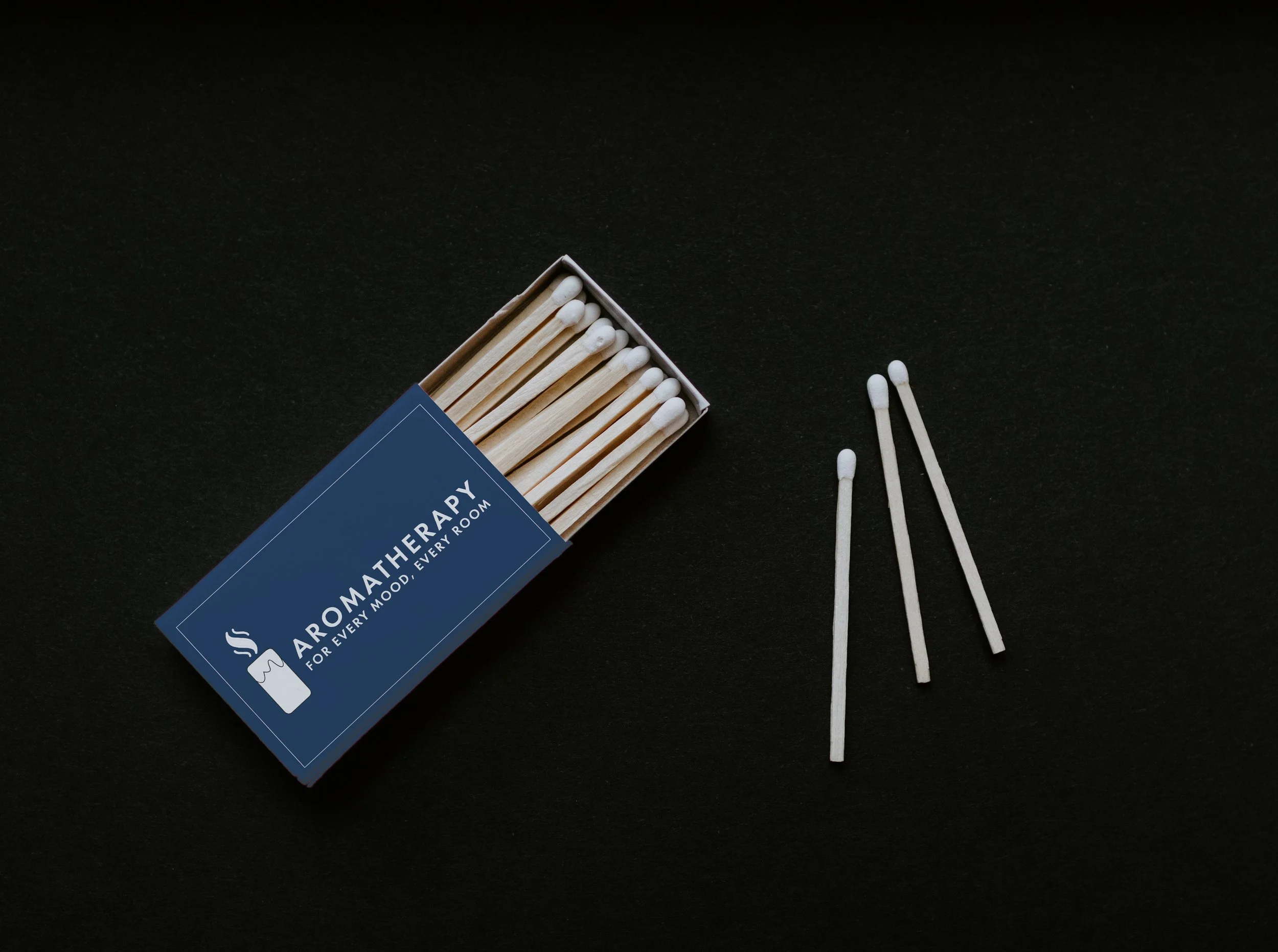
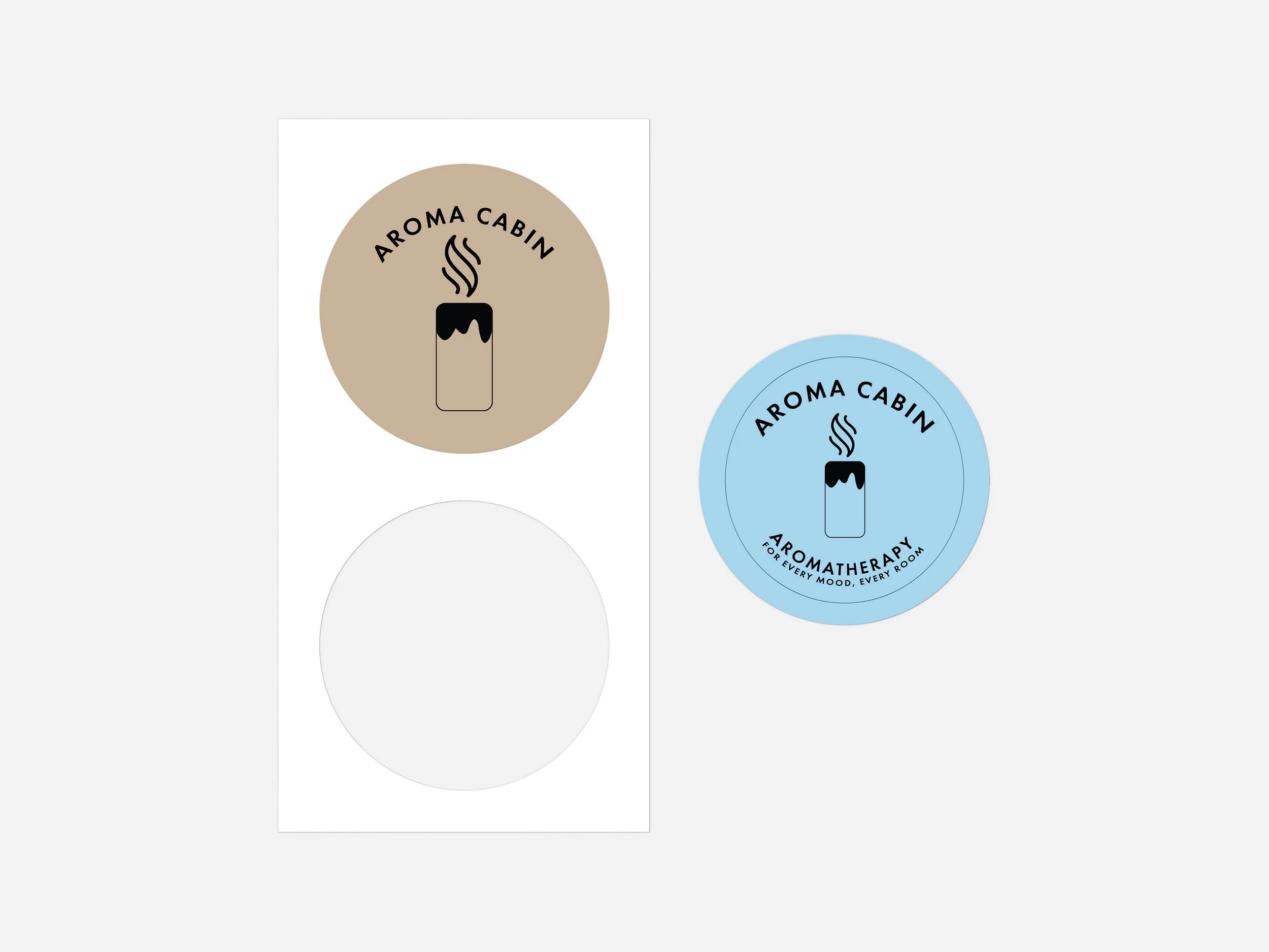
Figuring out the promotional materials for this project was a difficult thought process for me because there aren't many items that relate to a candle shop business, and there weren't as many mockups that would fit some of the ideas I had. So I researched on what items people would most definitely use, and finalized on three things:
Stickers
Matchboxes
Tote Bags (as an additional option)
I concluded with these items because compared to other decisions I made, it made much more sense to fit with a candle shop. Tote bags are reusable, Matches to be conveniently used for candles, and stickers for perhaps decorative purposes on everyday objects.
additional content


