
POSTER DESIGN
TYPOGRAPHIC MOVIE POSTER
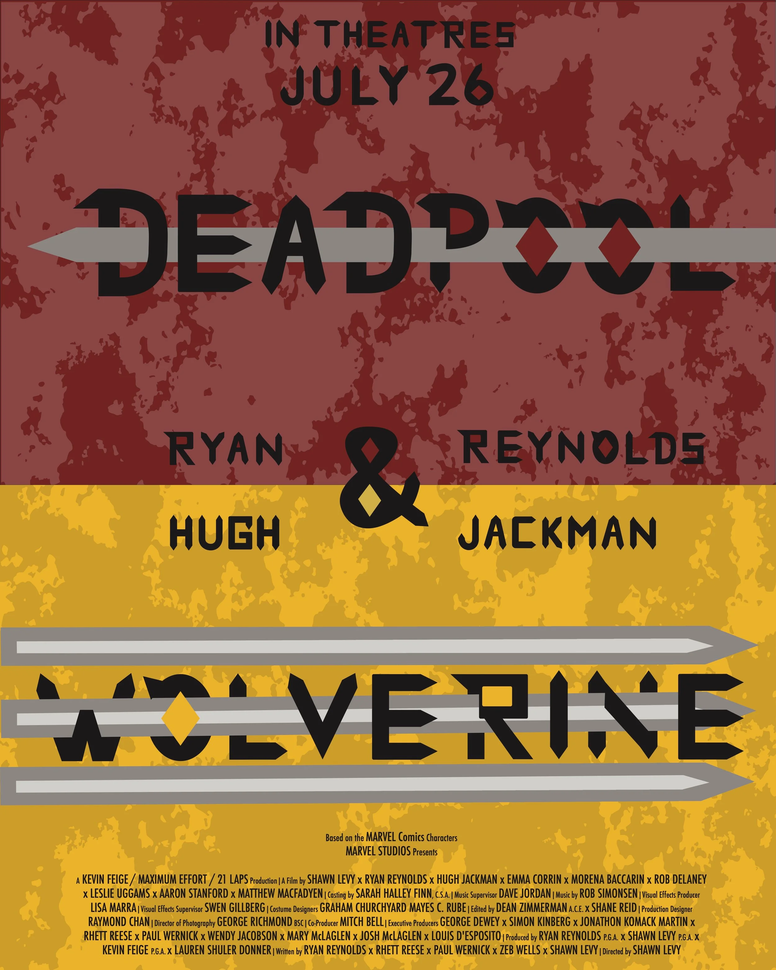
This project is a type-based poster dedicated to the movie, Deadpool & Wolverine using a custom typeface made from scratch as well as other graphic elements and textures to perfectly define what this movie is about.
Tools:
purpose
To develop a custom typeface for a movie of our choice, and to apply that to create a typography-based movie poster.
For an action movie that involves of a lot of fighting and language, this movie primarily targets an audience within the range of 18-30+ years old as the movie is not meant for a younger audience.
target audience
I have taken a strong interest in the new Deadpool & Wolverine movie since it came out, and it even led me to watch the X-Men movies after that. This is one of my all-time favourite action/superhero movies, not to mention the fact that I watched this blindly, so I wanted to choose a movie that fits 3 pieces of my criteria:
- Something I have a strong interest in
- It's a movie I have seen for the first time/blindly
- A movie that can also challenge me (design-wise)
the movie
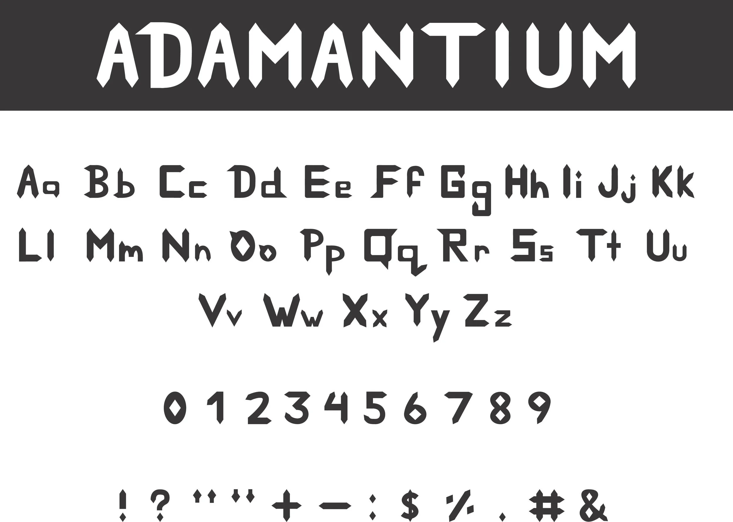
typeface design - adamantium
I first needed to create a custom typeface to help the movie stand out. As someone who has watched this blindly, I needed to do a lot of research on their characters and their trilogy to see what I can apply. I have watched the X-Men movies a few days later for the fun of it and they were really amazing (both for entertainment and for design inspiration), which lead me to my design idea I call the "Sharp Approach". Because this movie is connected to the X-Men trilogy, why not continue on that trilogy with a sword/claw-like typeface. I named my typeface "Adamantium" because I wanted to dedicated it to Wolverine's return, and since his claws are made of that metal, I finalized with that name to connect it to his return and to the trilogy.
The background I wanted to add something because the design felt too flat with just the solid colours, so I used a stained pattern that looks like dirt to make it look like they were on the battle field.
Main Design - I wanted to incorporate their weaponry as the main features of the poster, so what I did was I used their swords and claws to pierce through their names.
Release Date - Top center of the poster while I put the main cast's names on their character/colour.
Production Crew Details: I used Futura as my secondary font with the condensed width to make it look like a real poster, and made the crew titles smaller and their names enlarged.
movie poster
promotional materials
I had a lot of options to choose from to accomplish this step, but I went with the merch because this is a movie and it was also something I have a strong passion in. My main focus during this stage is to maintain consistency so that the designs don't clash or complicate everything
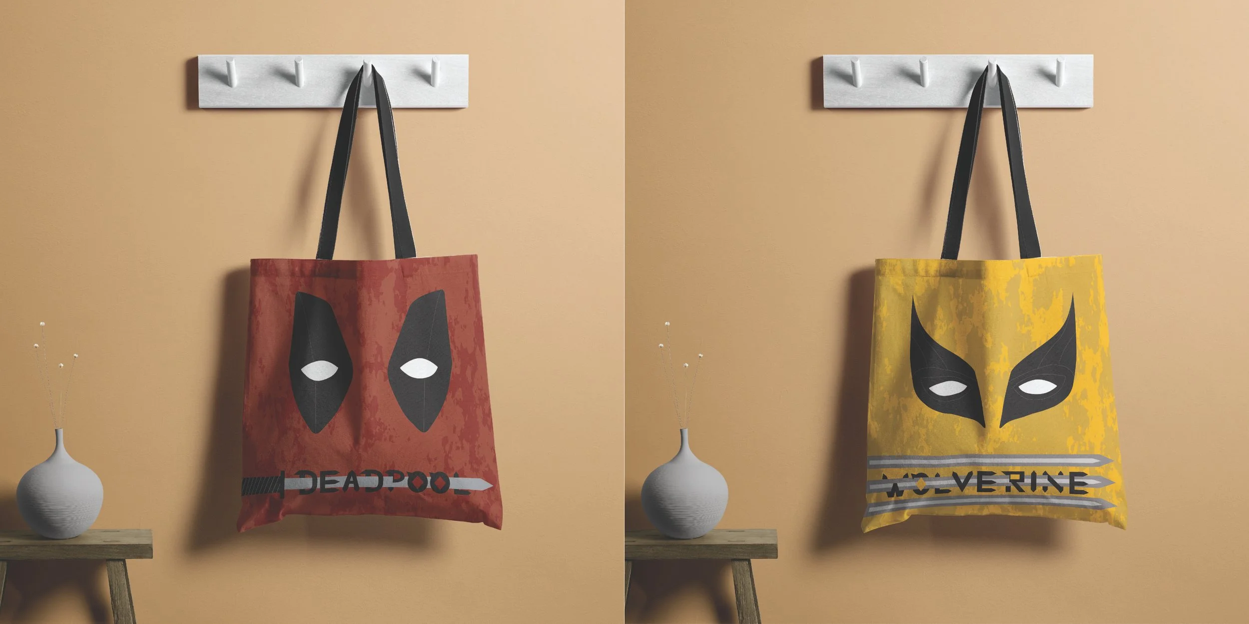
Tote Bag - I incorporated the same techniques from my movie and used the stained pattern as the background and used their weapons to pierce their names. I drew out the eyes to the best of my ability and even added the smaller details like the lines on their masks.
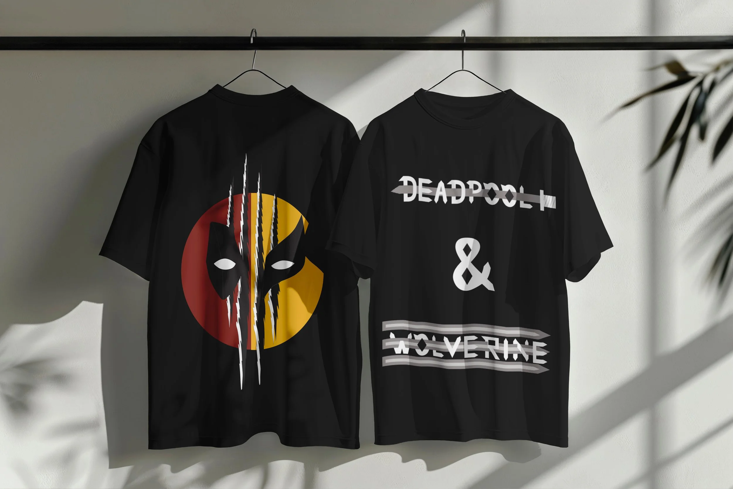
T-Shirt - I excluded the stained pattern for this design because it was making the actual design blurry.
Front - Used a whole circle as my canvas and drew half of their faces on each side. In the middle I drew scratch marks that were made by the Wolverine
Back - Written their names with Adamantium, with their weapons piercing their names
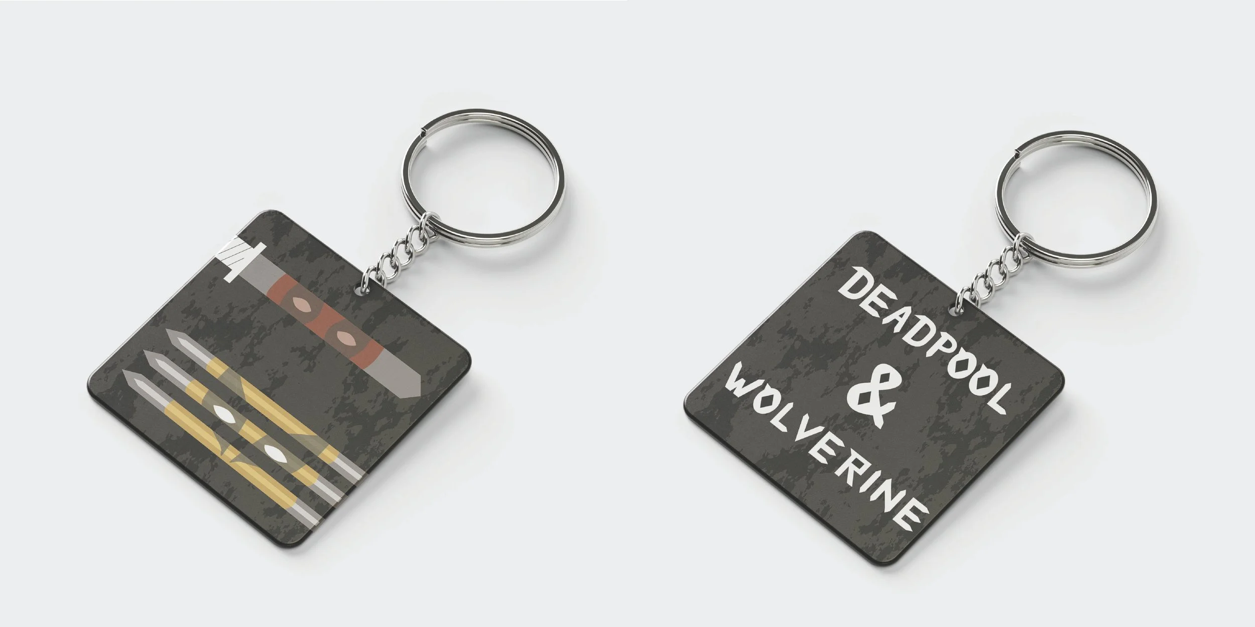
Keychain - In this design, I included the stained pattern because I wanted this design to also make it look like they were on the battlefield.
Front - Applied their weaponry on the front, and drew their faces ON their weapons, with a 53% opacity level to make it look like reflections.
Back - Written ONLY their names with Adamantium
additional content
conclusion
This was one of the most fun and creative projects I have done, and I am very proud of the final results, I think this project really helped me draw out more of my creativity in design. The typeface was also a very fun experience, this gave me a lot of insight on making your own typeface for your own design style instead of relying on existing typography.