POSTER DESIGN
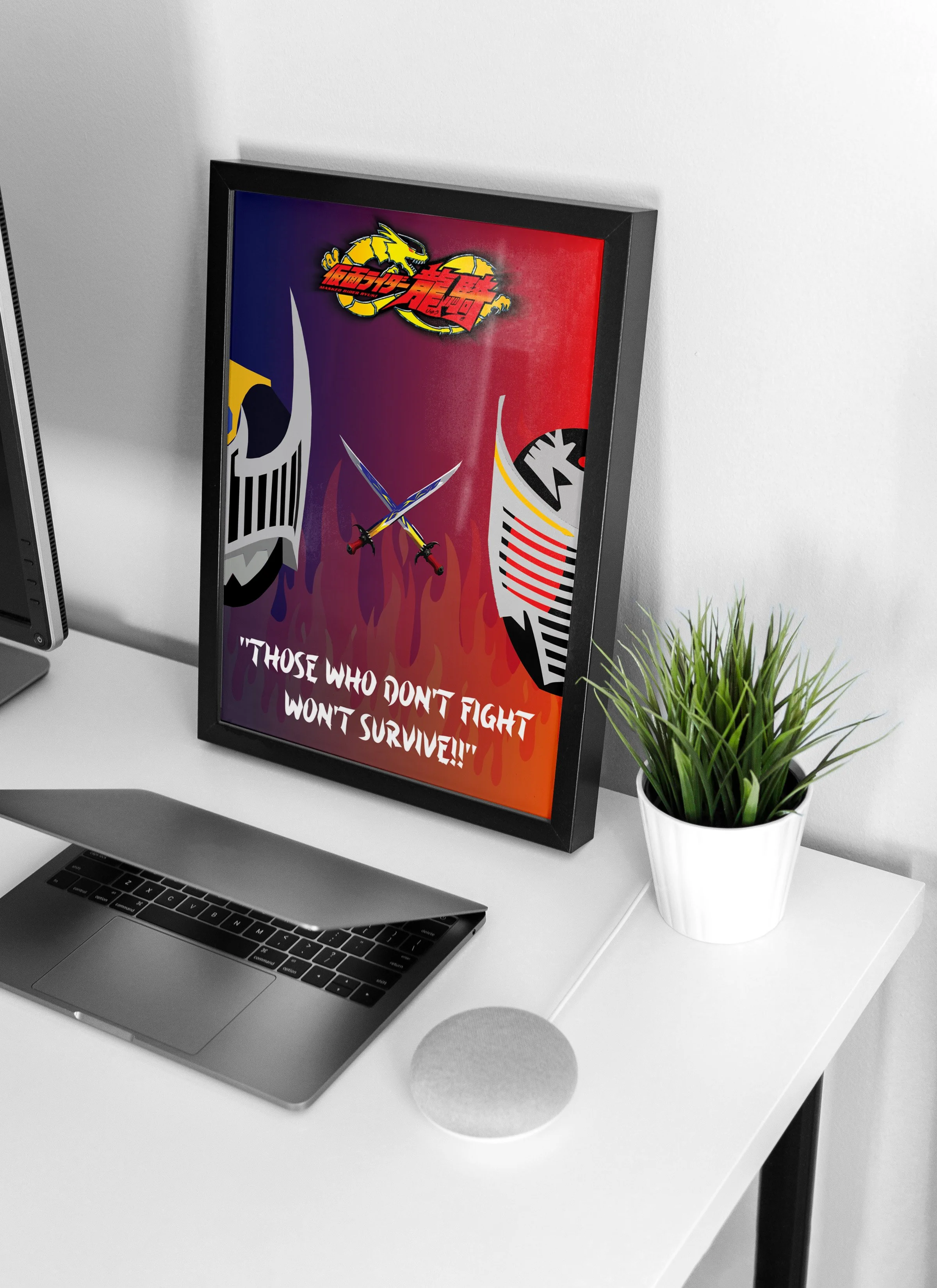
Kamen rider ryuki poster
For all the Tokusatsu fans out there, this poster says it all. As a fan of the genre myself, I have gained so much inspiration from this franchise and my dedication to the genre itself. This poster is dedicated to the third installment in the Kamen Rider Franchise, KAMEN RIDER RYUKI!
Tools:


To create a poster for international viewers to hear about a franchise that has been well known in Japan, to heed its popularity, strengthening its recognition by attracting a bigger audience to be a part of the fanbase for the franchise and the genre.
purpose
This project will focus on power and pride. The story behind Kamen Rider Ryuki wraps around a battle to obtain a wish for the last Rider standing, so it is rather dark and serious the fact that it is a desperate and violent choice to get one wish for anything, but a decent display that shows the characters understanding themselves and others. So I aim to make this dark but to ensure the meaning behind the catchphrase through design.
theme
The series catchphrase for this installment is “THOSE WHO DON’T FIGHT, WON’T SURVIVE”. The concept of this series is rather dark, explaining part of the catchphrase meaning, but the biggest reason is that the characters are trapped in a battle they can never escape until only one remains. Using this catchphrase will help me develop the design AND to capture the meaning and definition as well.
the catchphrase
Graphics
I did use a few graphics within this project because I want to challenge myself and make this on my own with less help from the internet as possible. I have used three graphics:
The Official Kamen Rider Ryuki Logo
Fire
Swords Clashing
After doing a thorough research on the characters and the show, the colours will be based on dark shades of red and blue. Each character has their own colour, so using a gradient to capture these two colours is perfect for the background, especially for the fire across the poster because due to its low opacity, it will blend well with the blue and red gradient background.
Colour
Selecting a good typeface was rather hard because the typeface I was searching for was to include a Japanese feel to it, but to give it a fighter vibe (if you know what I mean), but luckily I found the perfect one. The typeface I used was one I had in my font book for a longtime titled “Asian Ninja”. I have a few typefaces in my font book that resemble the preference I was looking for, and I finalized on this one because I love the shaping of the letters, even the small sharp details on them too and it really brought out the Japanese feel and fighter vibe in my project.
typography
additional content