
BRANDING
p1harmony “killin it” promo collection
This project is dedicated to P1Harmony's album, Killin It. Ever since their UTOPIA live tour plus the fact that I am also a P1ECE, I gained the inspiration from both myself and the K-POP community to create these promotional materials.
Tools:


To develop a P1Harmony-themed notebook that symbolizes the group's identity, style, and values in recognition of their recent comeback, Killin It. The notebook is both a utilitarian tool for taking notes, journaling, or sketching and a collectible item that allows fans/P1ECE (such as myself) to express their love and support for the group.
purpose
target audience
This notebook design is primarily aimed for P1Harmony fans, who are mostly adolescents and young adults, primarily those who are passionate about K-pop culture. Fans are enthusiastic about collecting products and merchandise associated to their favourite artists, and they like incorporating components of their fandom into their daily life to demonstrate their loyalty and support for the members.
group greeting
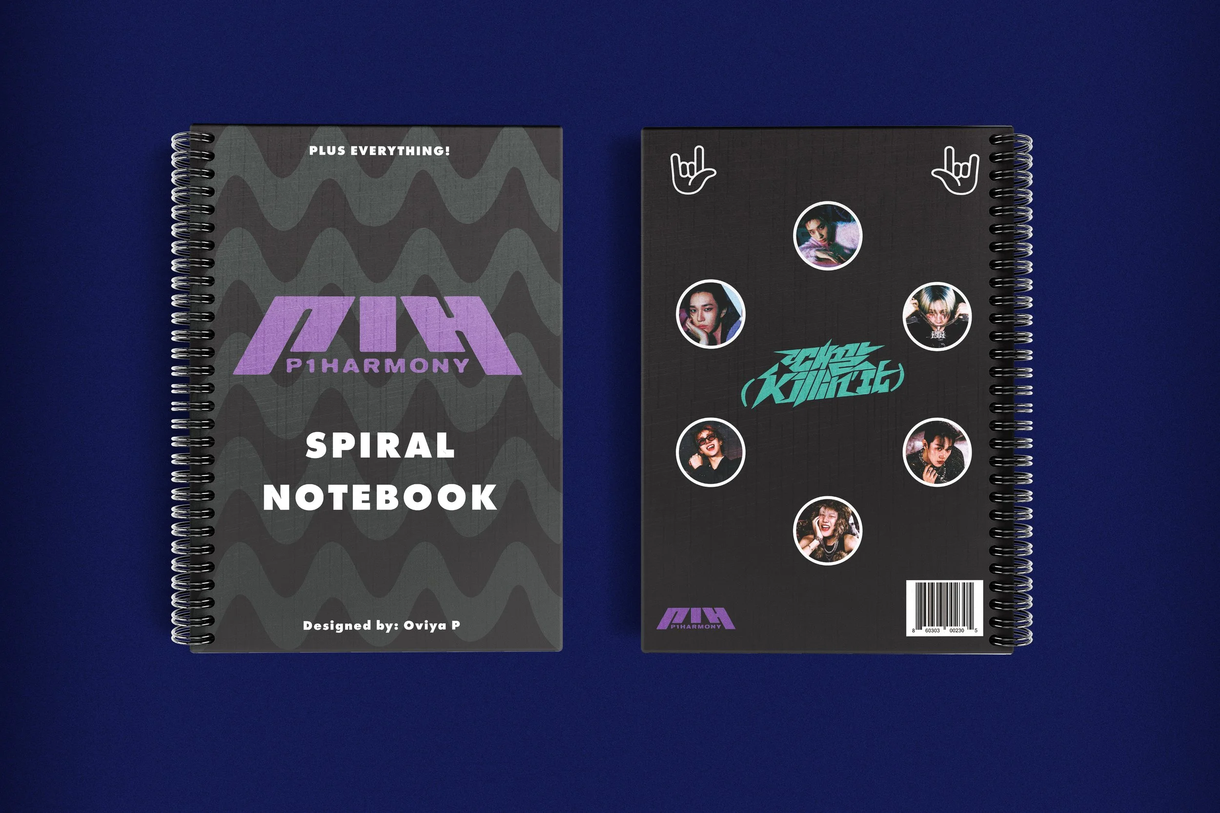
Other than the Killin It graphic, the logo, and the members, I wanted to included something smaller on the top of the front cover. Originally, I was going to add an additional credit that says its designed for the P1ECE fandom but that would cover half of who my target audience was. So I decided to including their group greeting (PLUS EVERYTHING) to add more of the group's identity to really make this project say "This Is P1Harmony".
typography
The typography for this project will be a typeface similar to the typeface style in their logo. I planned to avoid using Arial only because it was the most basic typeface and the styles it had were not bold enough to be visible in the design, so I experimented with the Sans Serif fonts I had in my font book, and concluded with Futura PT, with the Extra Bold style. The heading of the notebook is at 60pts, while the subheadings (slogan + design credit) are at 21pts because I didn't want it it be too large or else it would crash in the pattern too much and in the mockup.
colour
The colour palette for this project will be consisting of four colours only. Black will be the base colour of this design for both the front and back design, while white will be used for typography, iconography, and the stroke on the circles on the back cover. Purple will be used on the P1Harmony logo on the front and back, while turquoise will be applied on the Killin It graphic on the center of the back cover. The P1Harmony logo have many colour variations for every album/comeback they have. Since this design is specifically for their recent comeback, purple will be the colour I will be using.
Graphic elements
Wavy Pattern - Background pattern for the front cover only to match the theme. There were so many wavy patterns and I had to choose between three options, and this was the closest to what I wanted. Originally, I was going to apply this on the back cover but it looked too overwhelming in the mockup, so I kept the back plain.
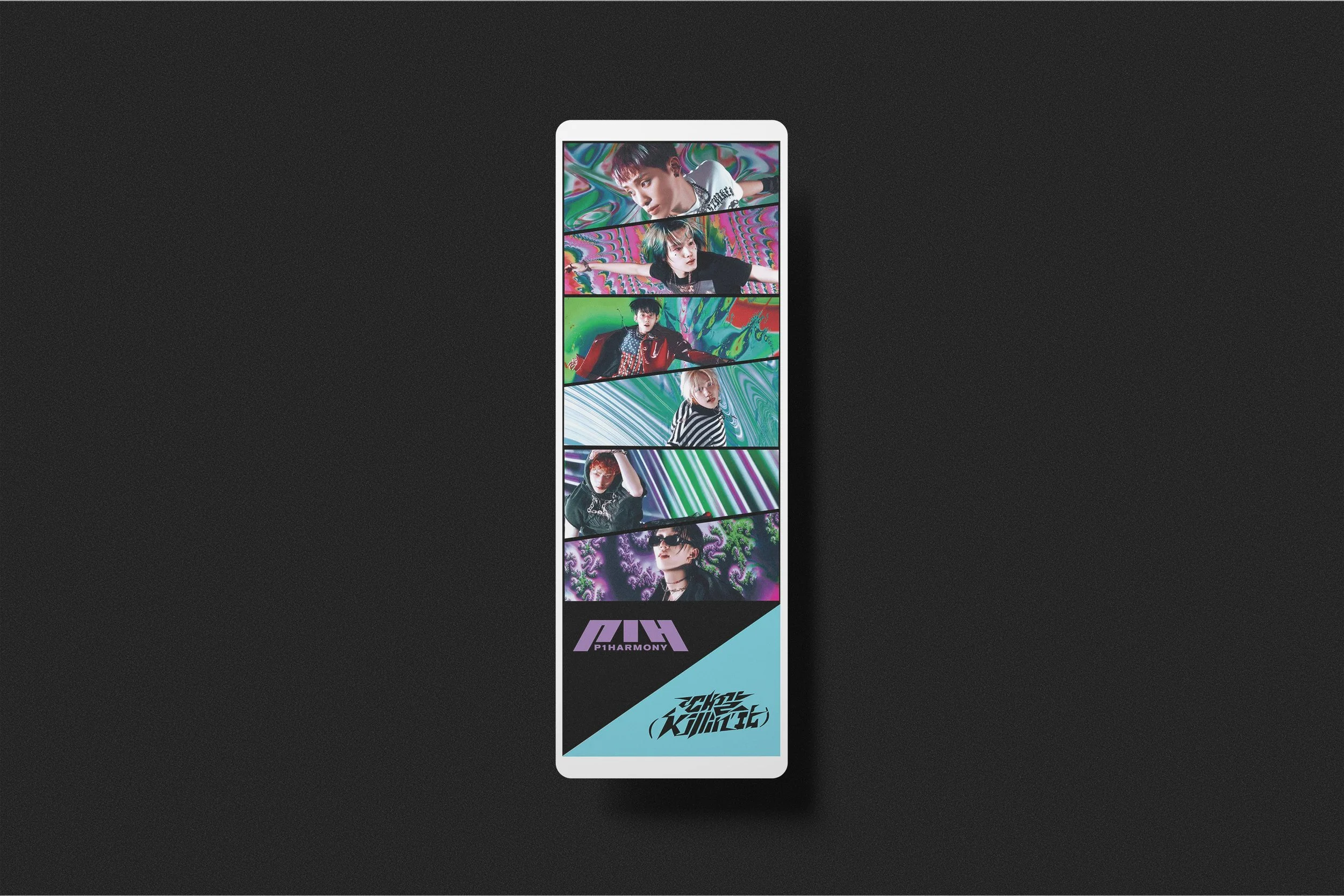
P1Harmony Logo (Purple) - Enlarged and centered on the front, and a smaller version left aligned on the bottom left on the back cover of the notebook design.
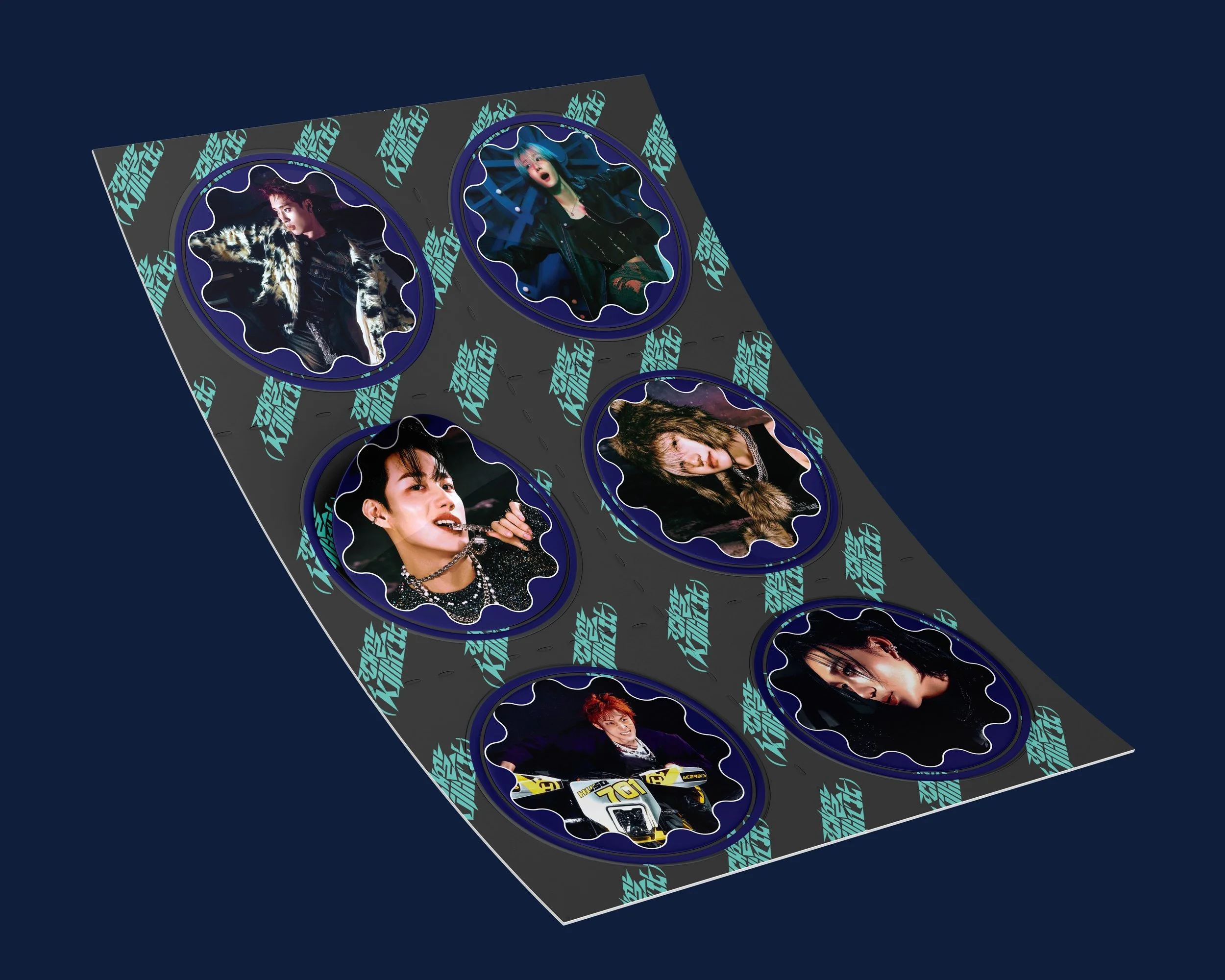
Group Members - All six group members masked in a small circle, with a 5pt white stroke, circling around the Killin It graphic on the back cover.
Killin It Graphic - Centered on the back cover, surrounded by the headshots of the six group members of P1Harmony
Barcode - For Product Identification/Point Of Sale/Efficiency purposes as this is a physical everyday product.
iconography
Only one icon is applied throughout this design, and that is on the back cover. I used an icon that symbolizes this emoji, 🤟, commonly known as the love you gesture. My plan was to incorporate the title track's signature dance move from the music video, and this hand icon was the closest to the description I was aiming for.
additional content

Conclusion
This was a really fun project to make, and created at good timing as well. The group announced their UTOPIA Live Tour was announced a few weeks after Killin It came out, and Toronto was one of the locations. And after getting the tickets to their concert in May, so many emotions were flowing through me. Inspiration came through to me so fast when I was talking to my friends in the P1Harmony community, that I made these designs.
The P1Harmony promo collection captures the enthusiasm and excitement of the group's recent comeback, while also giving fans a fashionable and usable accessories. The design conveys the spirit of P1Harmony's music and concepts via carefully chosen typography, colours, iconography, and visual elements, appealing to both their dedicated fanbase as well as K-pop culture enthusiasts.