
BRANDING
Bon Appâtisserie Brand Identity
An international patisserie that sells pastries and other desserts from all around the world. With their experienced, foreign chefs, they create these desserts from scratch in front of all the customers to demonstrate the art of pastry making. This kind of opportunity allows others to not only enjoy the experience, but to also explore that career in the food industry.
*Not an existing business
Tools:

To develop a totally new and unique logo, along with a collection of assets for an international patisserie based in Canada.
purpose
Target audience
The target audience will be focusing on both genders aged 17-50, as the concept for this business is elite, new, and rare, but also this age groups leans towards the type who gain an interest in pastry making or those who enjoy desserts in general.
Objectives
My biggest objective is to make these designs speak their brand and their values, to showcase that this patisserie has more to offer compared to other patisseries. Other objectives include:
- Build brand awareness
- Increase marketing
- Target new customers
- Introduce a new experience
- Enhance customer relationships
Message
The message for this business is to grant customers the chance to sample exquisite pastries from throughout the globe made with such intricate techniques and customization. All the desserts/pastries are 100% authentic, from the ingredients to the quality. You are given the opportunity to watch professional pastry chefs create their delicacies FROM SCRATCH, transforming them into an unparalleled immersive experience.
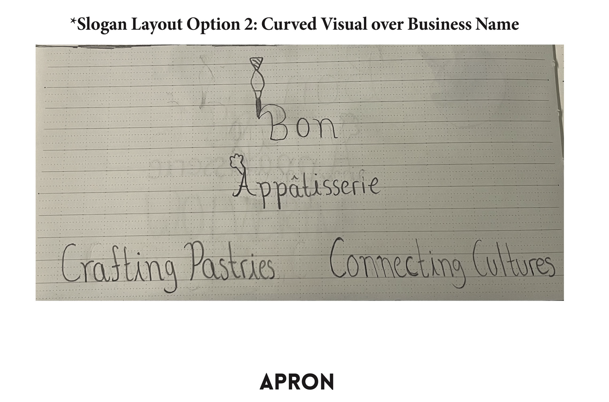
Using the slogan, "Crafting Pastries, Connecting Cultures", I will be able to convey global inspiration and commitment to workmanship on all the business cards, packaging, and aprons for the assets required.
brand ideation
When developing a brand name, I love to be clever when creating the name because I think that is one of the many ways you can convey what this business does. I developed five names to choose from and after having my fellow peers and friends vote on what's better, I finalized on Bon Appâtisserie because according to them, "this name conveys an elegant but also casual feel of the brand, and applying the term, "Bon Appétit" definitely was a clever move to make".
typography
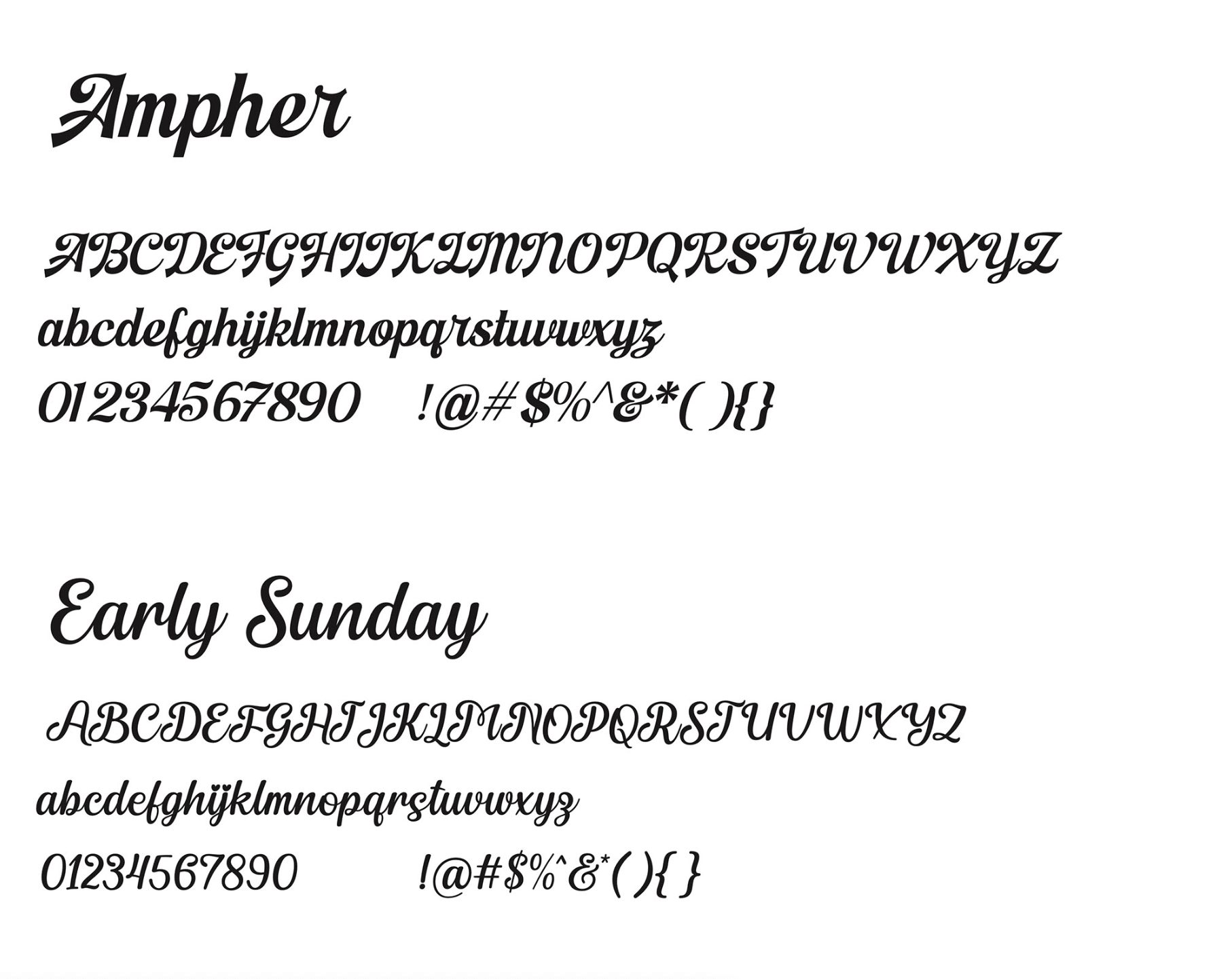
I wanted my word mark to maintain the elegant and casual feel I was aiming for because this is aiming towards the target audience I have detailed above. After writing the four options I had, I did another vote on which is better and to receive any feedback that could help when I start designing them on Illustrator/Photoshop. I got an amazing response from my peers and I personally thought this was a smart move to maintain the theme I wanted:
"The typeface, Ampher, would be a perfect typeface for your word mark because this perfectly defines the elegant feel of your theme; one of your script typefaces make your word mark hard to read so it is better to choose a typeface that is consistent with your theme but also to make it easy to read. To maintain the casual part of your theme, you can use a typeface like Futura for your slogan, that can define the casual part of theme, and take advantage of your creativity on how the layout will be."
graphics
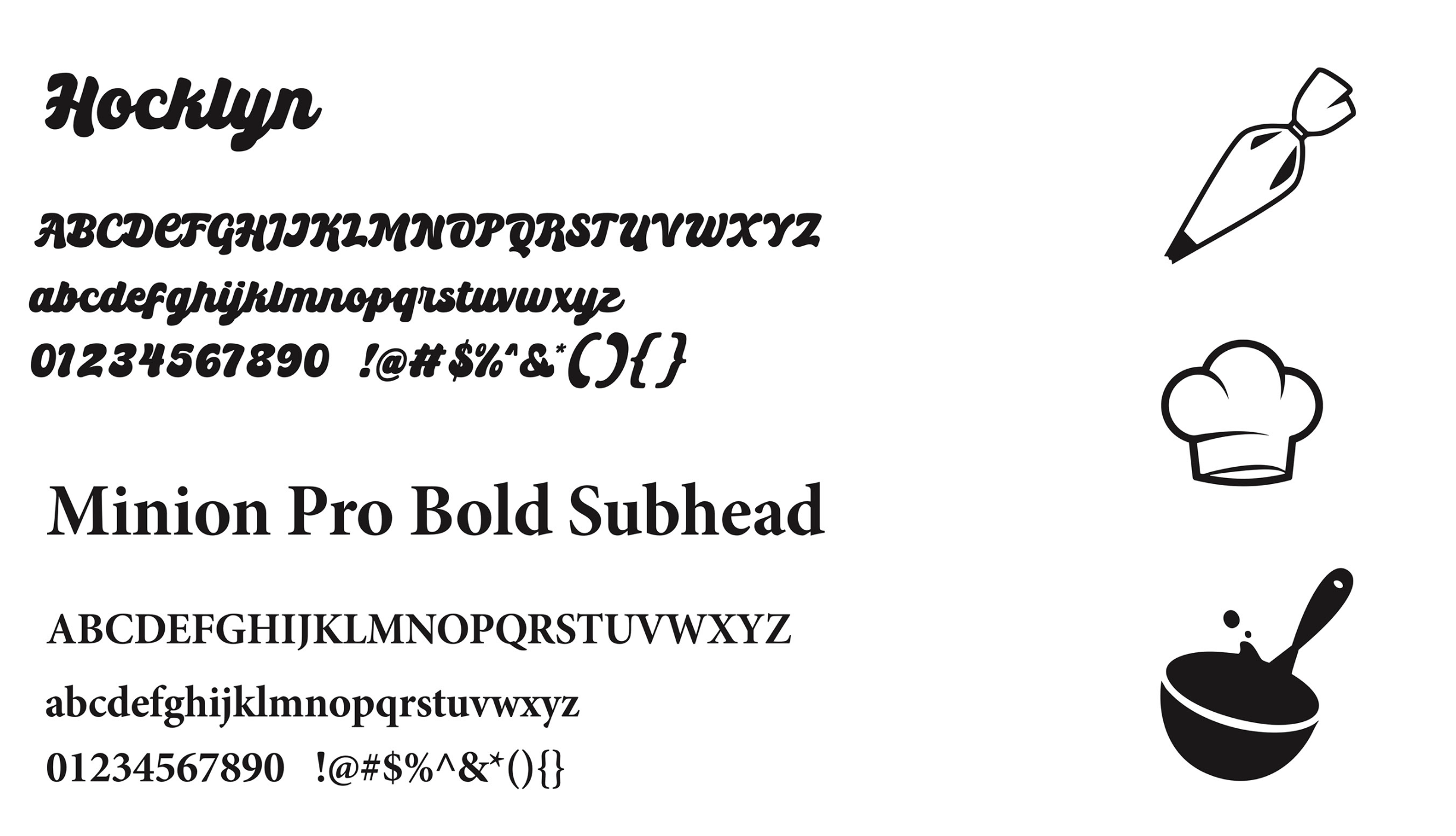
I did not want to include too many graphics in my logo/word mark, so I included just one graphic and drew them out using the pen tool.
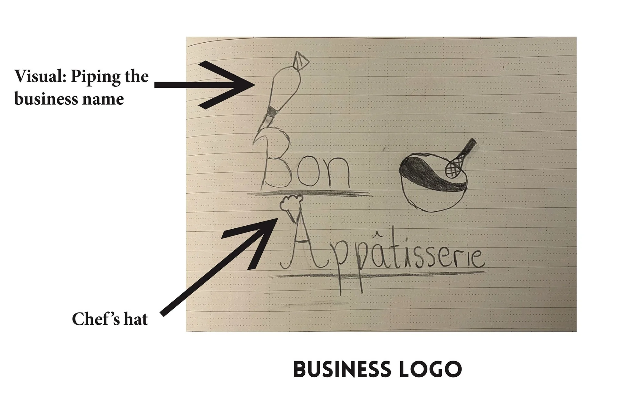
Whisk: It will be a heart shaped logo to define passion and a friendly business
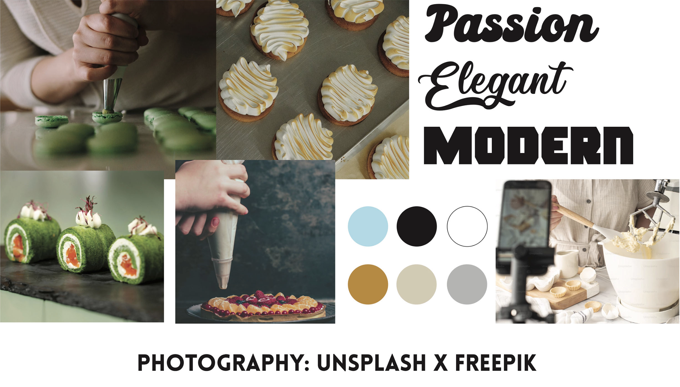
Moodboard
I got a lot of feedback from my peers and my professor saying this moodboard would make the brand stand out more because colours like pink is a common and often expected colour in patisserie and bakery branding. Since there are many of these that use pink, this could feel more distinctive by offering a fresh or unexpected approach.
Sketches
Logo - The piping bag will be piping out the letters, while the chef's hat will be placed on the letter A of Appâtisserie. The main logo will be beside the word mark as it is stacked.
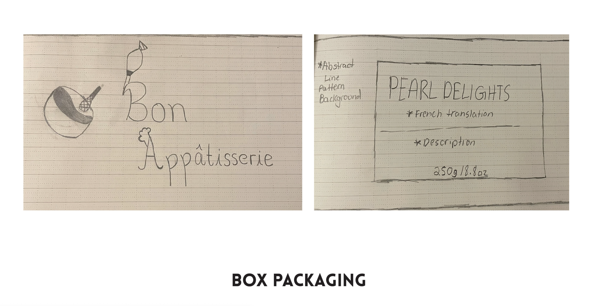
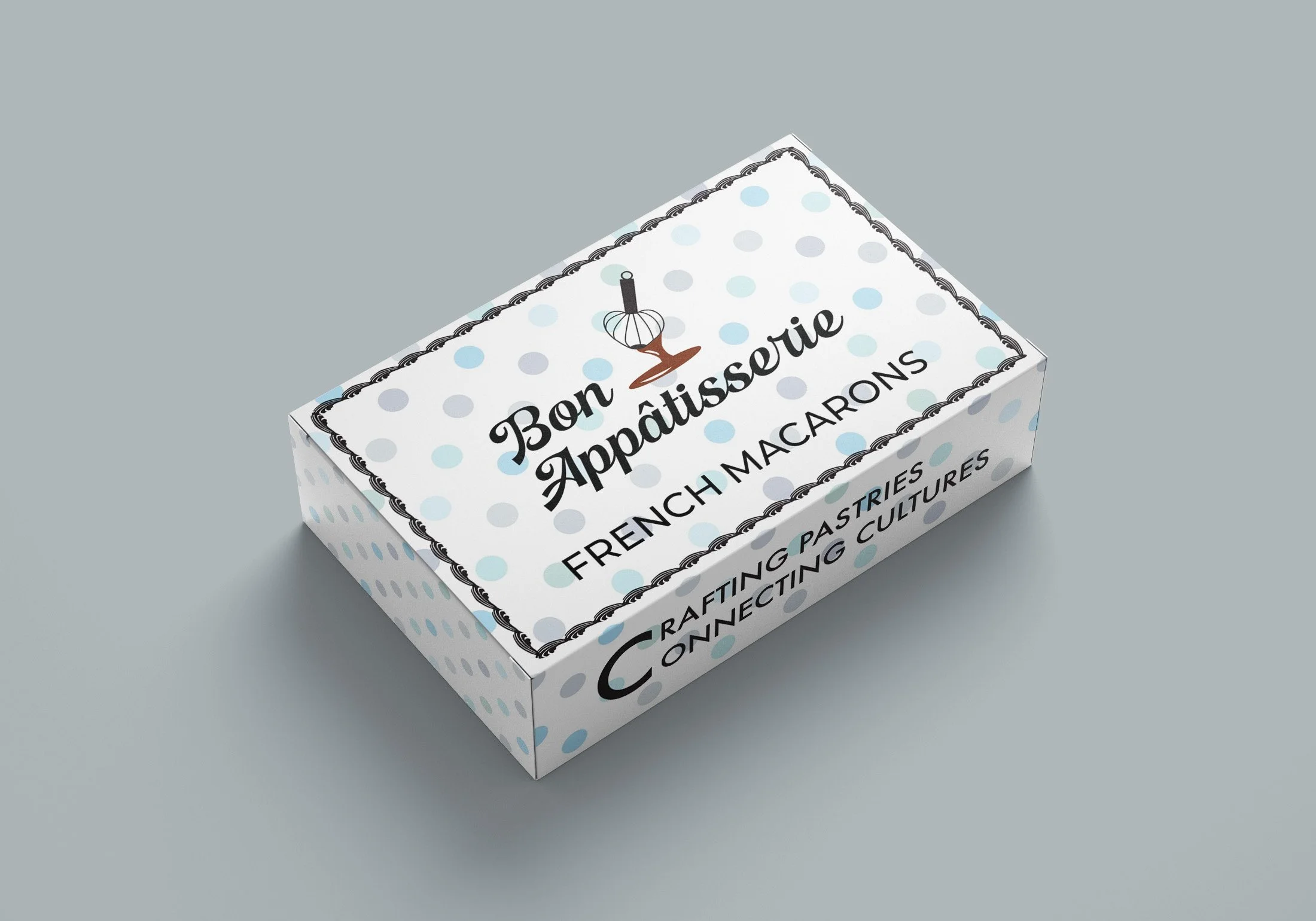
Box Packaging - Same approach as the logo, but the placement will be opposite of how the logo was sketched. The colour we aim to make the box be will be either brown or a pastel blue colour, and we will include abstract patterns as the base for the box itself. Since I am designing two different box packagings, both will have their own uniqueness as this is for specific types of desserts like macarons.
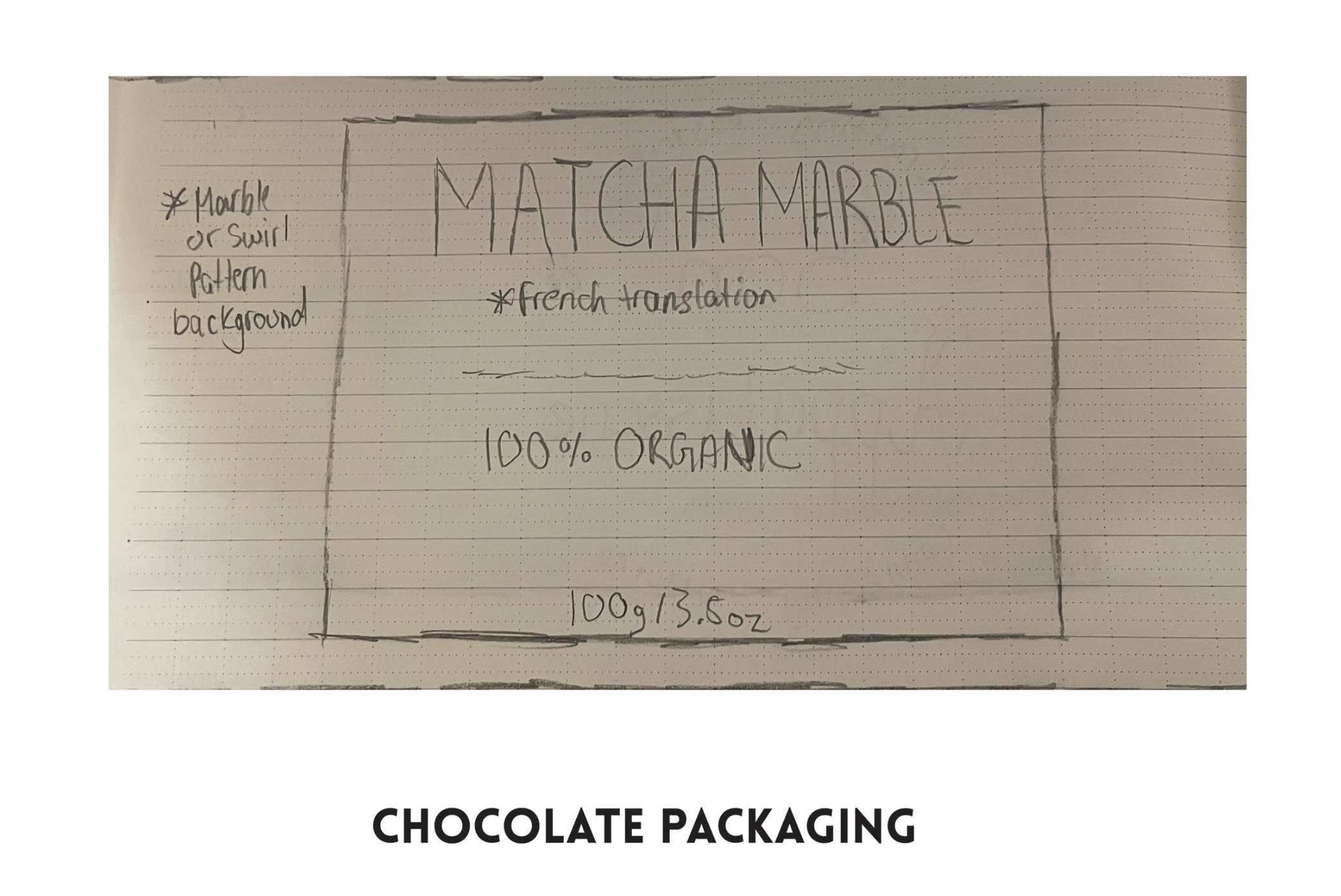
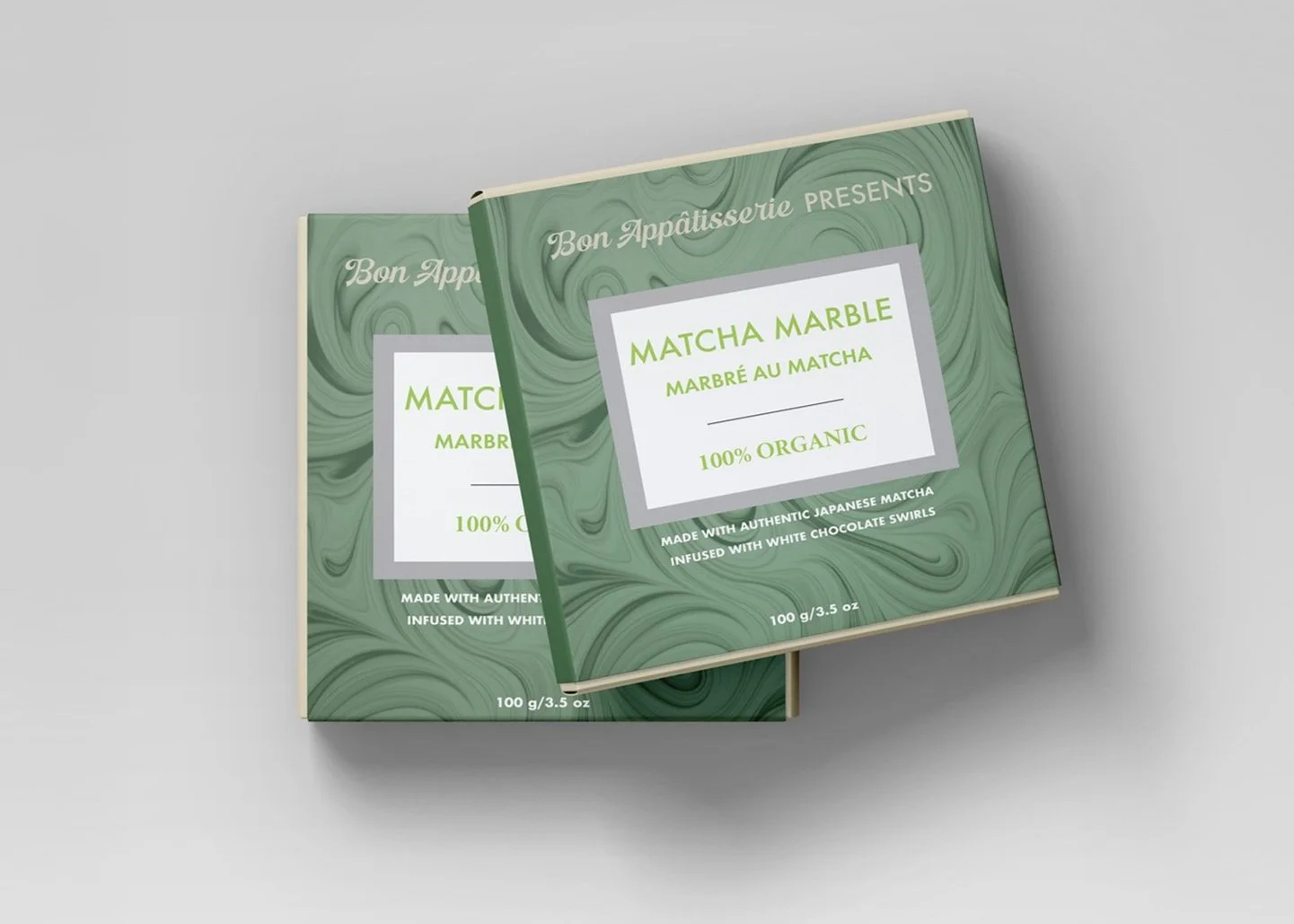
Chocolate Bar Packaging - This was one of the assets I felt very excited about because its a good way to use my own interests to passionately create the design. Keeping it simple to use a pattern as the background and some shapes to create the label. The typography is what I will be experimenting with for this design.
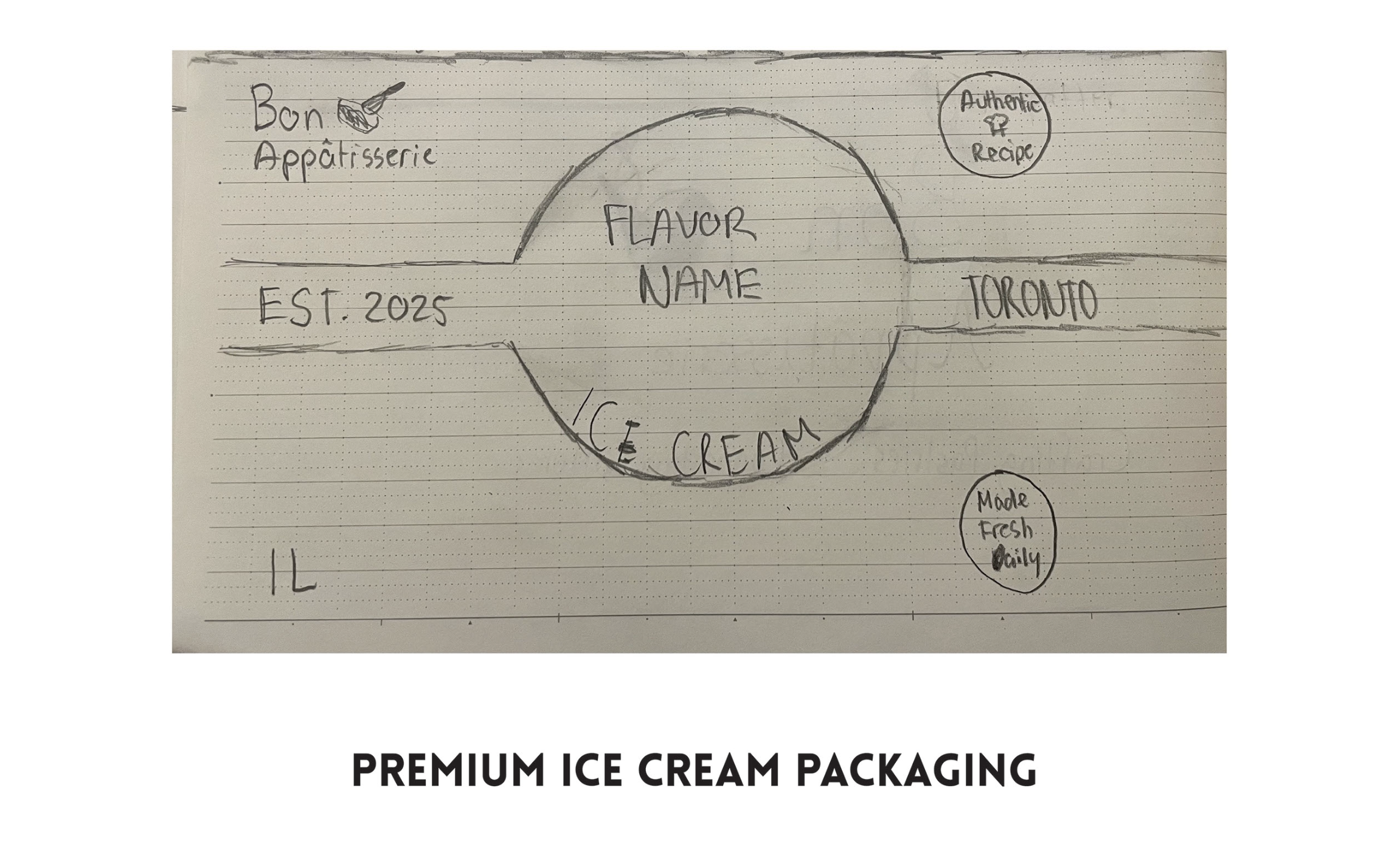
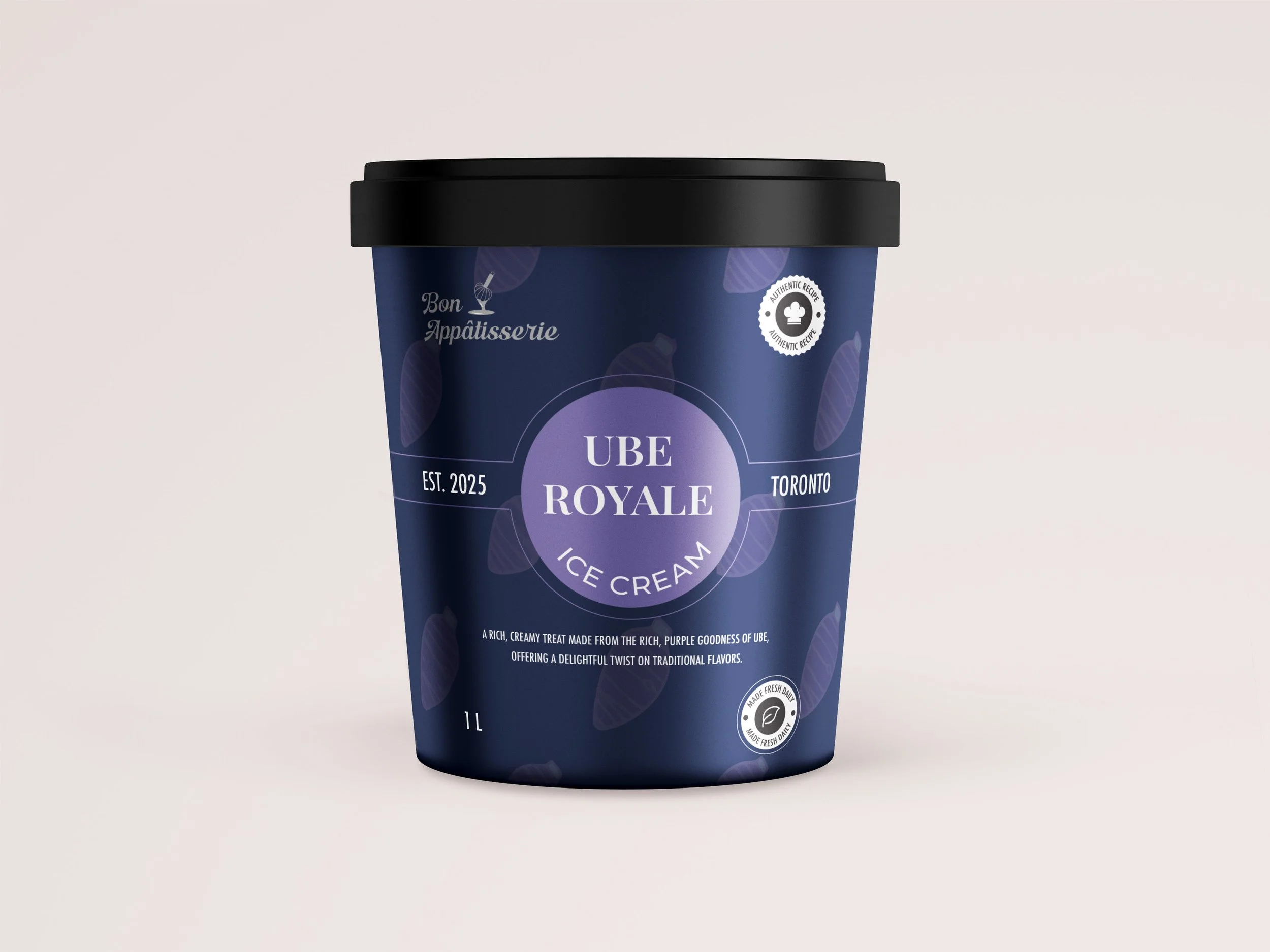
Ice Cream Packaging - This design is for a one litre ice cream tub so while I was sketching, I also kept in mind be creative as possible as I will have a lot of space to create the design. I plan to create this according to the flavour, so if I were to do pistachio, use a pattern and/or design elements to correspond to that.
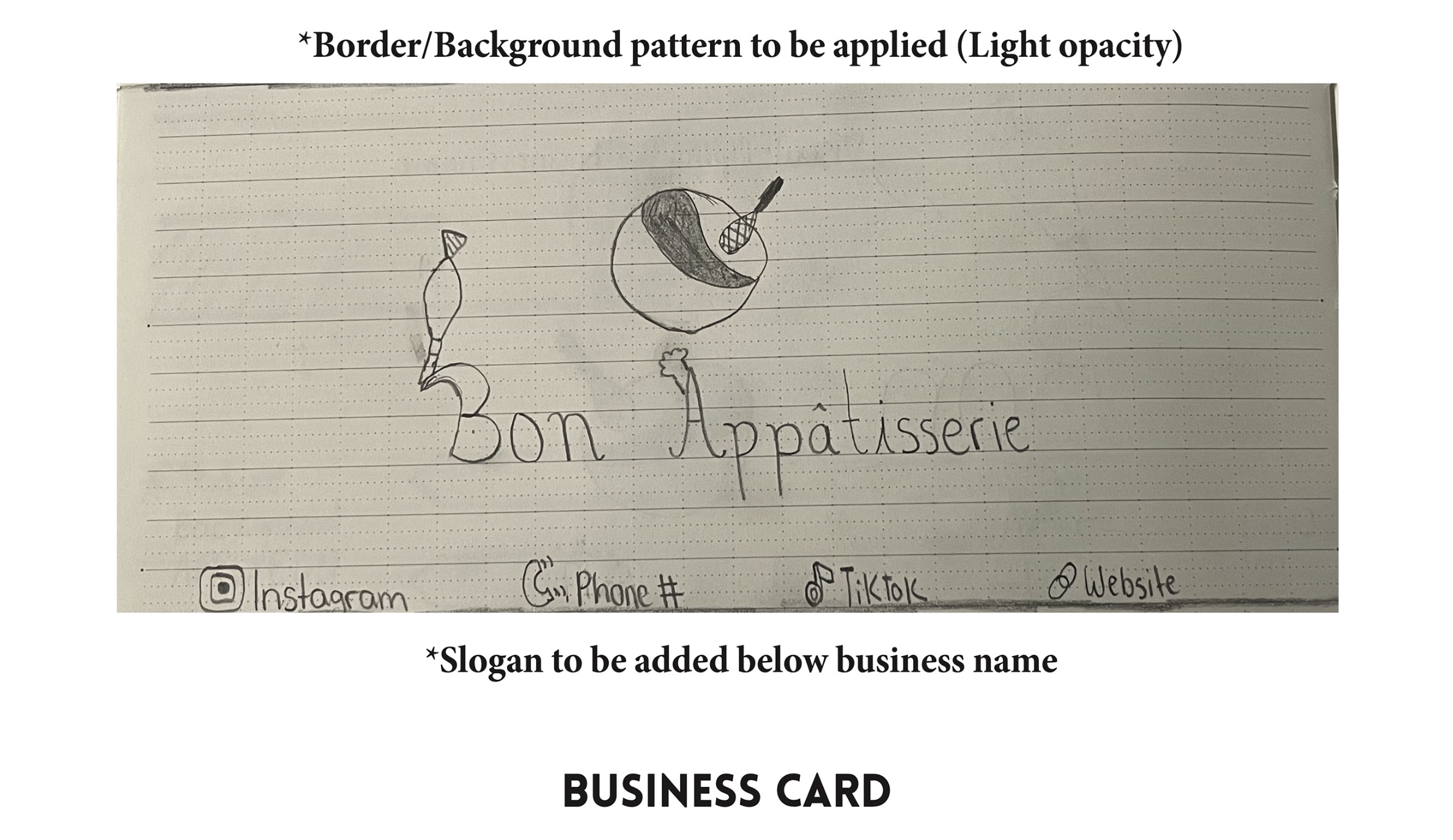
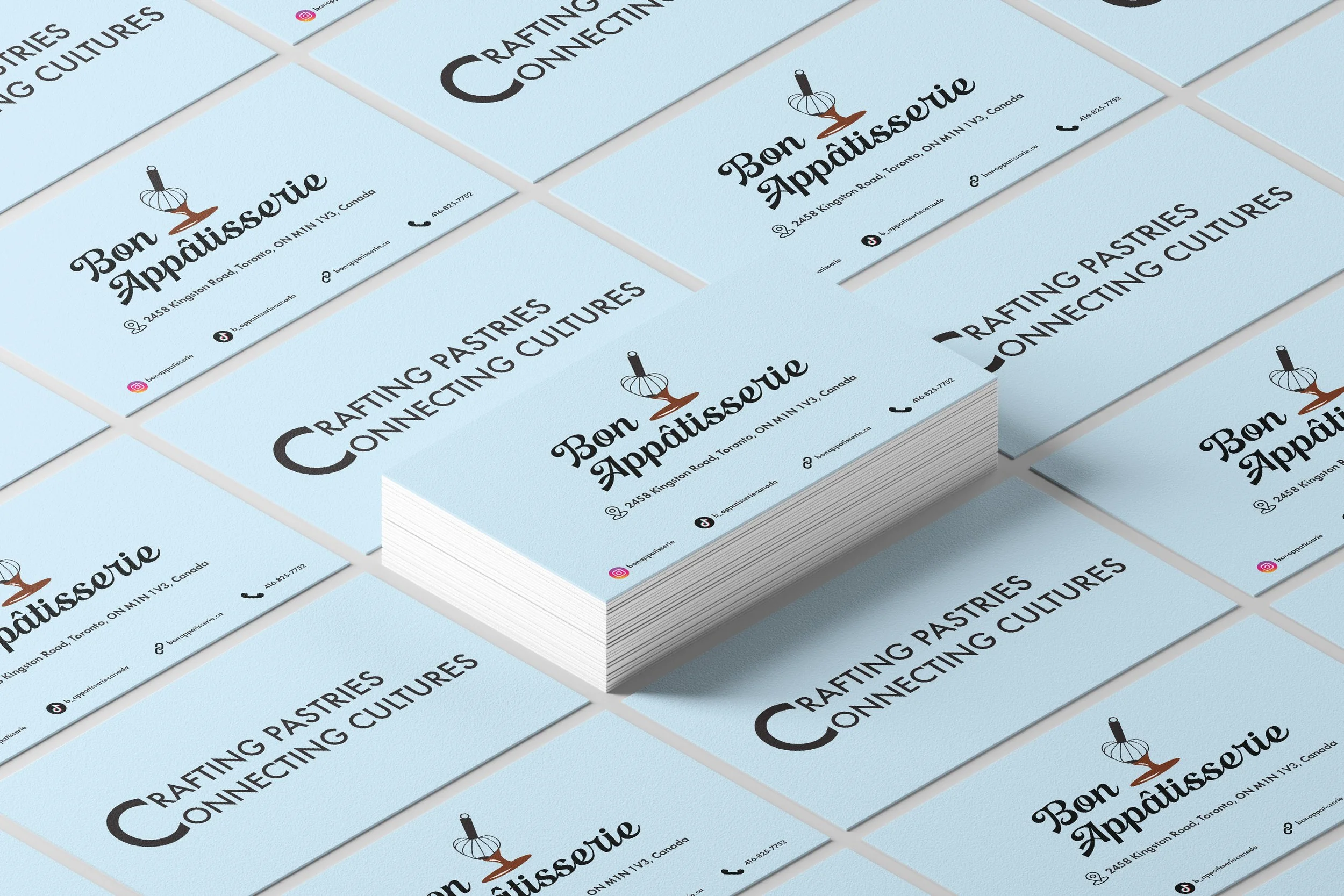
Business Card - The word mark will be on one line while the logo will be on top of it. The business card will be white, and the written details will be placed differently: the address will be placed directly below the word mark and the socials will be placed on the bottom of the card, 0.5-1 inch away from the edge.
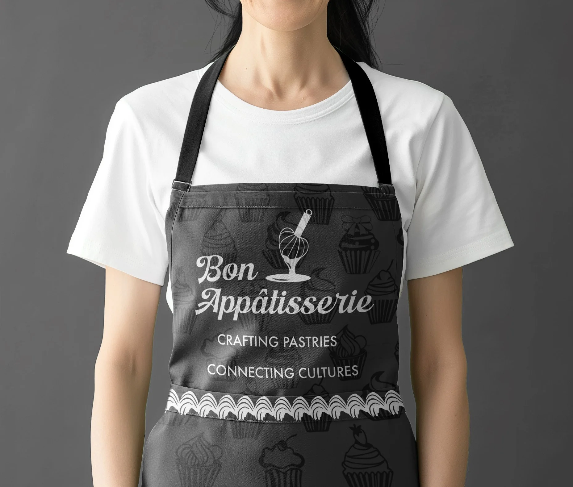
Apron - Originally, my plan was to have the whole apron design, but after researching some apron design visuals, I decided to design the top half because no one will see half the design if I did the whole apron. I will be applying the word mark AND the slogan in the design because if I were to add the logo too, the design will look crowded and that is something I want to avoid.
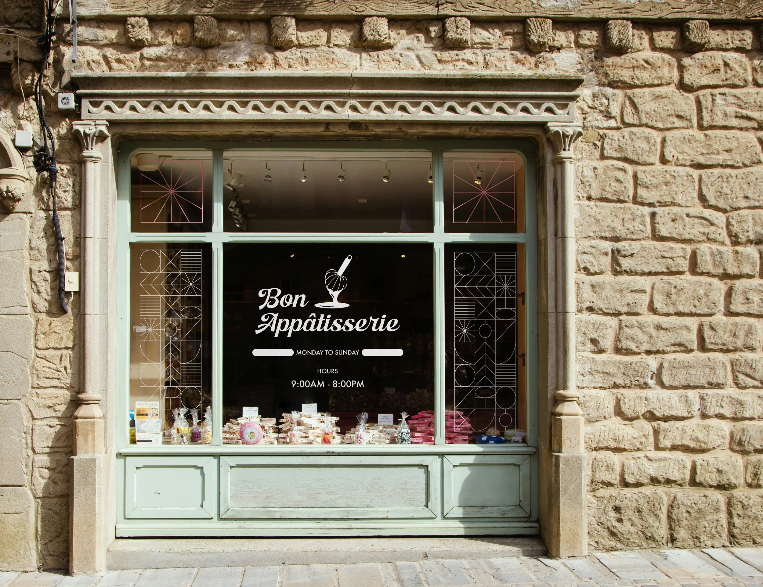
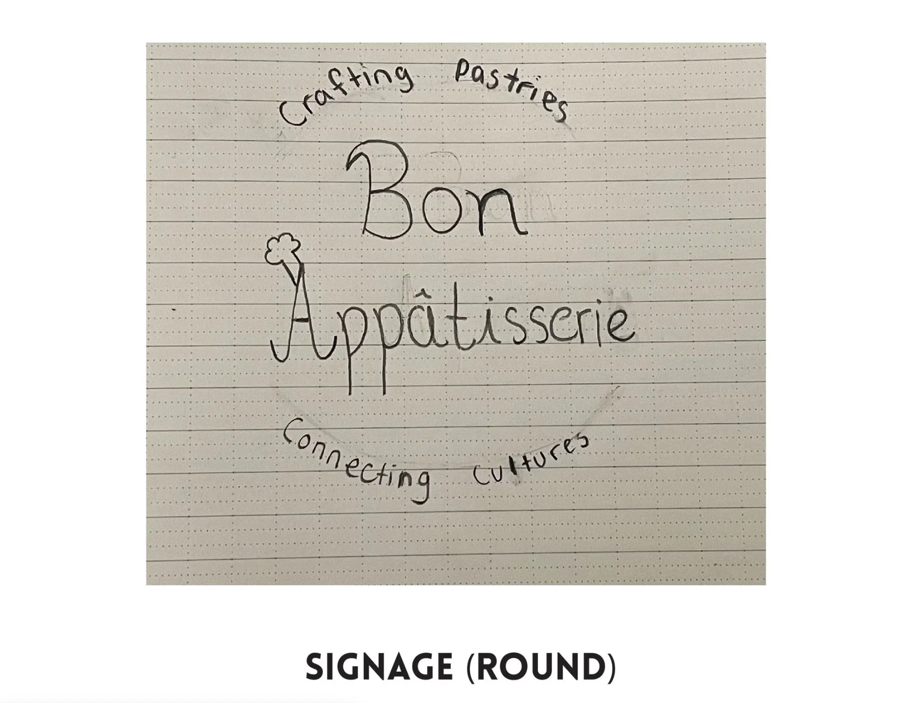
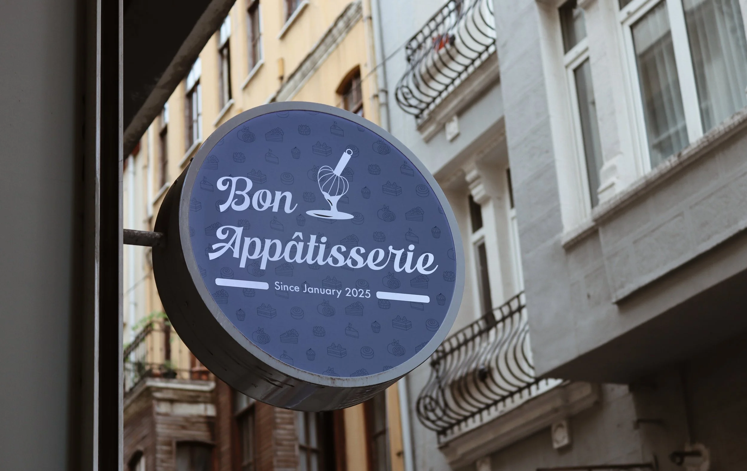
Signage - Same approach as the apron design, and I will include special markings like the establishment date and/or their hours, 0.5-1 inch away from the logo to have some space to breathe.
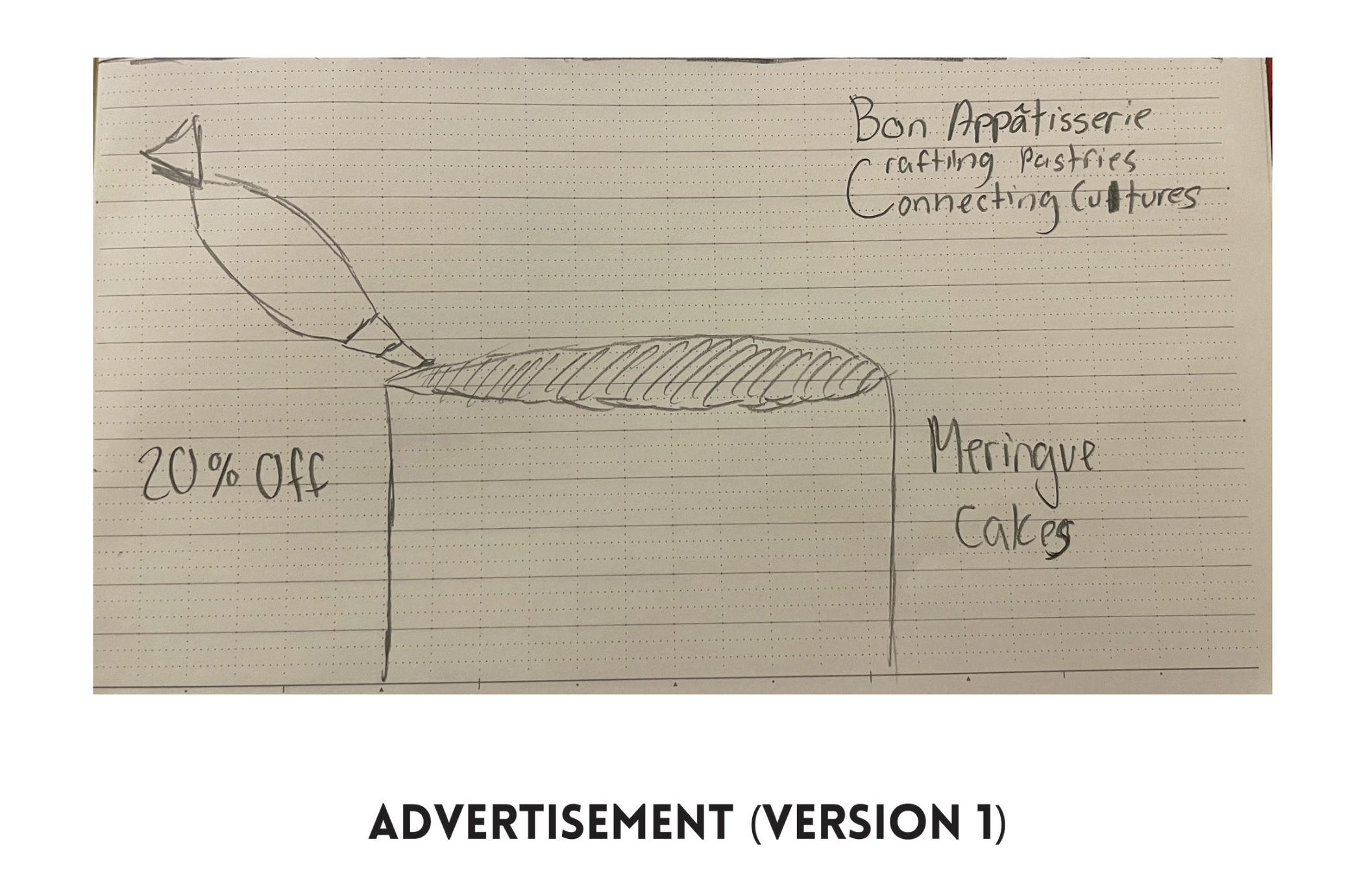
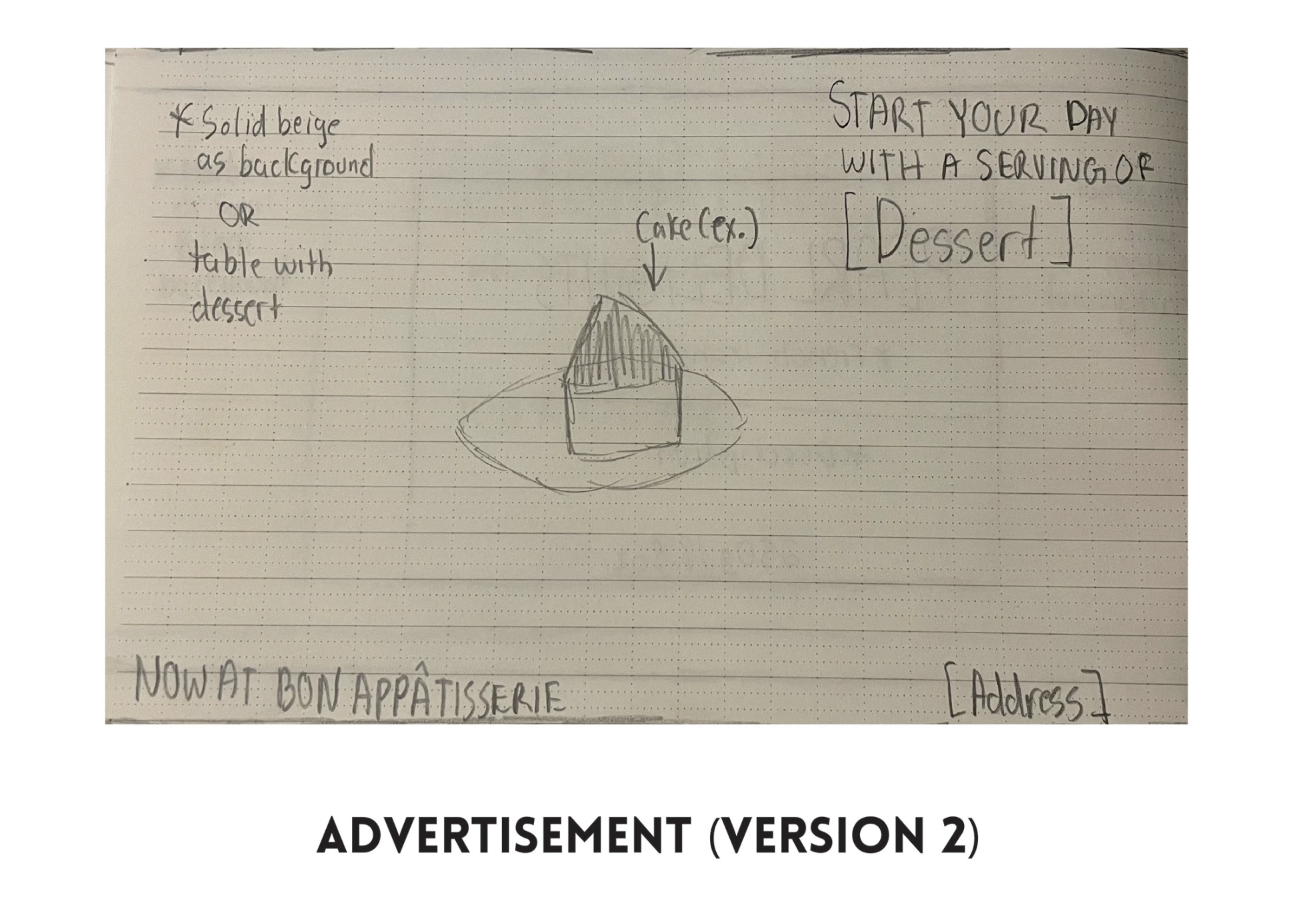
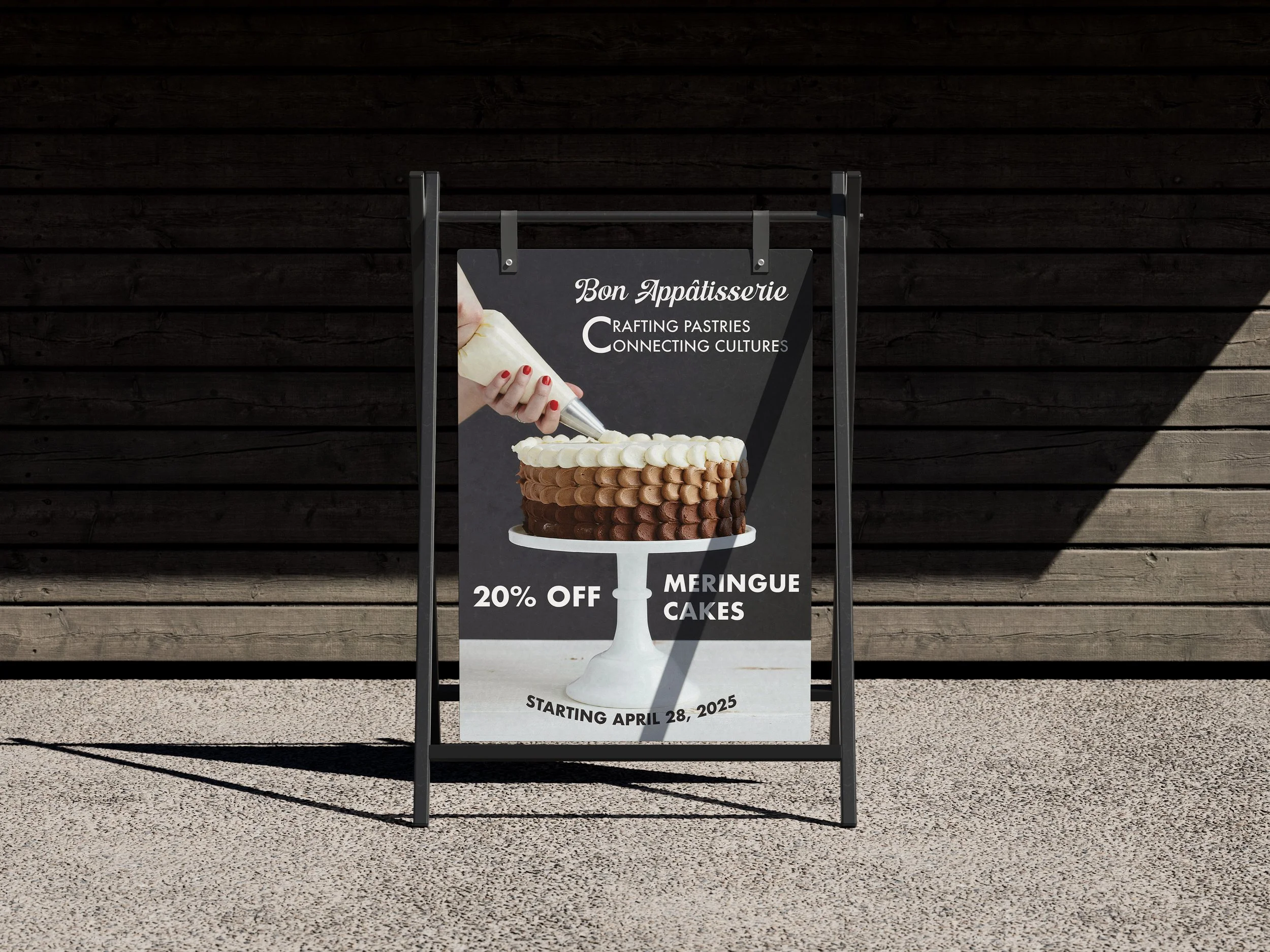
Advertisements - I want them to both be designed differently and they both will have their own ad style. For the billboard it will advertise a 20% discount on specific desserts, in this case, meringue cakes. And for the A-Stand, it will sponsor a dessert instead of an offer, in this case, it will sponsor the tiramisu cake.
Final products
Logo - The feedback I got during the design stage was elements, more specifically the graphics EXCEPT for the whisk, may not translate well in your logo, especially at smaller sizes. The level of detail in the icons could make them difficult to read or recognize quickly. So I experimented with my logo in terms of scaling and indeed it was hard to see. So I removed the piping bag and the bowl and adjusted the design of the whisk since that was an element I thought would be better incorporated into the logo, and did the scalability test once more and it looked a lot better.
Box Packaging - I had previously used a pastel blue colour for the box colour and I received feedback saying the the brand name was readable, but needed something more. So I switched the colour to white and used a spotted pattern with a 30% opacity level and it made the readability better. I added a border pattern on the box to make it look more creative because the design look very plain on the mockup. I even took a step further and decided to include the slogan on the front flap of the box.
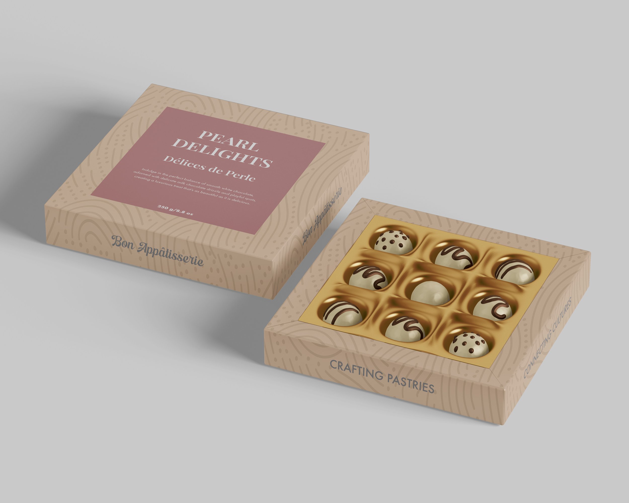
BonBons Packaging - I have three designs I felt very proud of, and this was one of them because it really spoke the theme of the business. In this, I used an abstract line pattern as the background, and created the label using rectangles as that base to contain the written details of the dessert, Pearl Delights. I played around with my colour palette and my typography to find the perfect combo for the packaging and it worked out pretty good, leaving a beautiful display of bonbons.
Chocolate Bar Packaging - This was the second design I felt proud of because as someone who buys a lot of specialty chocolates, I got a lot of inspiration from the packaging and thought I could use that in this design, with a little twists and turns. So for the Matcha Marble packaging. I combined a solid rectangle with a matcha color and a marbled pattern with a 30% opacity as the background, and just like the bonbon packaging, I used rectangles for the label, one for a border style design and the other to cadd the written details. Typography is applied using Futura to write all the details except for the 100% oragnic note, which is written in Minion Pro Subhead Bold.
Ice Cream Packaging - This was the third design I felt very proud of because I never done ice cream packaging before, and I thought this would be a perfect opportunity to show the same level of creativity on my other designs on this one litre ice cream tub. For Ube Royale, I used a dark blue or purple color and used an ube pattern as the background. I created the label with the help of some shapes and the scissors tool to design the border. I used Playfair Display to write the flavour, Montserrat for the subhead, and a condensed style of Futura to write the description and weight. I designed two labels to fill in the large gaps I had: an authenticity seal to define that it was made using an authentic and original recipe and a "made fresh daily" seal for honesty purposes.
Business Card - This design I feel very proud of because this was a design that needed minor changes. Previously, the card was white and during peer reviews, I was told that the colour should be change to a colour in the pastel colour palette because using white on a business card for this brand makes it look too corporate.
Apron - I didn't include the logo because given the space I had for it, it would make it look tight or crushed, even if I were to scale it down. The layout of this design was for the women apron collection, if this were to also fit for the men collection, the only changes that are needed is the size.
Signage - I felt very confident with the plan I had for this design because I thought it showed a little more of my creativity. Round signage includes a pattern as the background and added the logo and establishment date to make it feel more official. Storefront is designed on the window so I included the logo and their business hours, all in white to maintain readability for close or far POVs.
Advertisements - These were also designs I had confidence in because I had a solid plan with no cracks. The billboard showcases the ever popular tiramisu cake, with a friendly message saying this dessert is a fantastic way to start your day wherever you go or whatever you are doing. For the A-Stand, showcases a meringue cake being decorated to show others what the discount item is. I used Futura for the whole design except for the logo of courses, to write the offer and the release date.
challenges
- Visual Appearance - I cared a lot about making the designs and my presentation look good and professional, it was something I was told a lot about during my Editorial Design classes and how it could impact my grades and also me as a designer. I have been stressed a few times over the appearance because it is something one looks for in a graphic designer, so this was something I put a lot of effort in if I want to feel like an official graphic designer.
- Logo Design - The first time I created a logo was a few years ago, and the feedback I got was that the detail was too much and so I had to decrease it. During that time, I took note of that every time I did a branding project. In this case, the feedback I got was when designing a logo, I don’t have to be overly literal—sometimes, a more simplified or abstract representation can be just as effective while maintaining clarity and scalability. It wasn't too big of a challenge but this made me learn that some wordmark designs are fine just the way they are as text.
- The Number of Assets To Create - This was a BIG project for me to work on, considering the amount of time we had to work on it, so the ideation was tough because you don't know what is enough for a project, even when your on a tight deadline. But as a dedicated designer and the type of person who gets to work ASAP, I put all the effort in this project to achieve the expectations as well as meeting the deadline earlier than expected.
additional content


final thoughts
I love doing brand identity projects because it was a good way to expand my creativity as a designer. This was a fun project to and given the time we had to make it, it was a good way to test my abilities in time management as well as my other skills. The amount of feedback I got with this project didn't make me lose the confidence, but in fact motivated me because not everyone is perfect, they have their own style of accomplishing the work. It saved me from making mistakes I could've made during the design stage and it opened my mind to exploring other ways to achieve a certain look, whether it's the logo, typography, mockups, etc. The more projects I create, the more I learn, and that's a benefit I believe we all can enjoy if we want to become better versions of ourselves in the design world.