
POSTER DESIGN
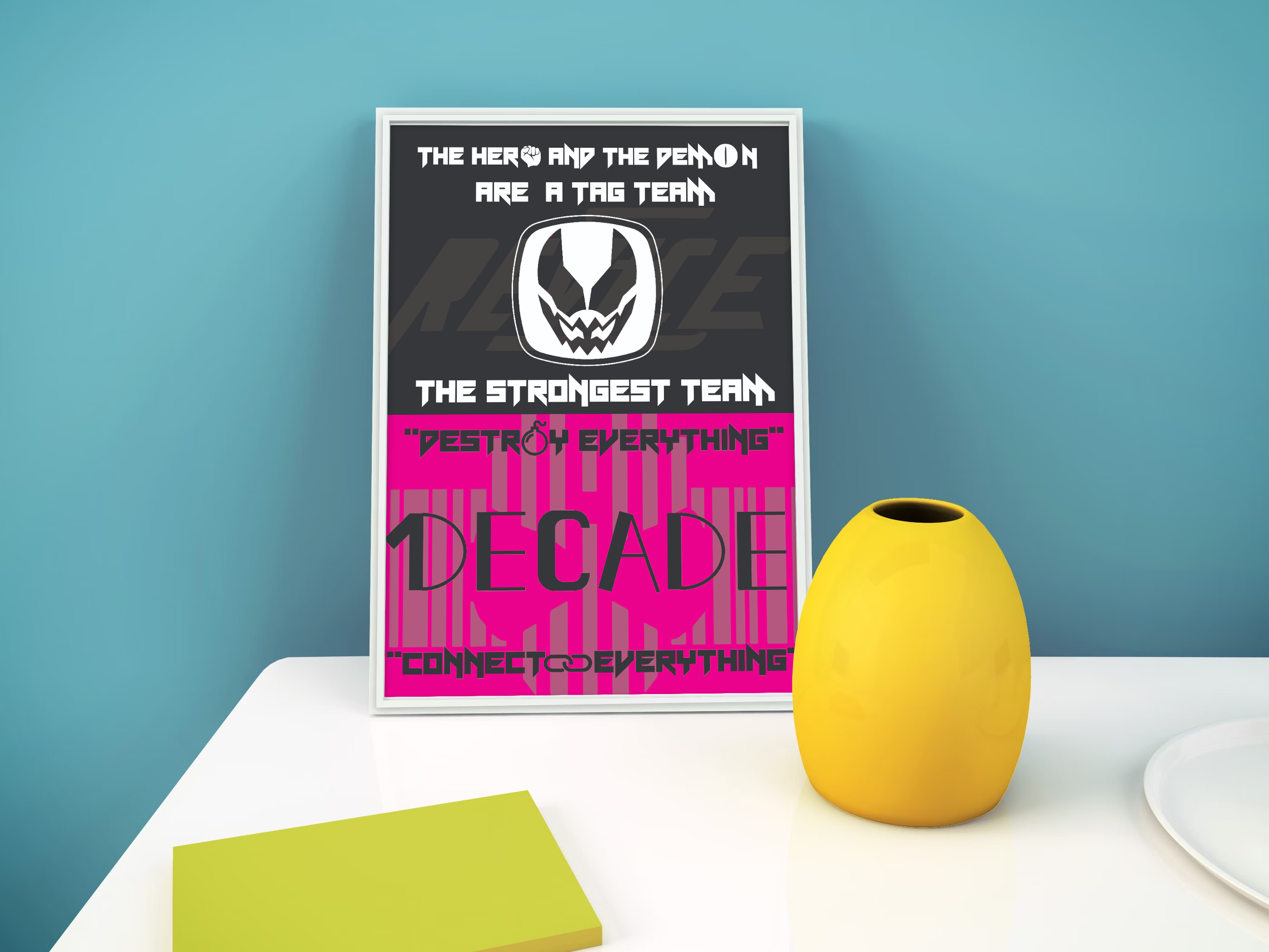
KAMEN RIDER REVICE X DECADE POSTER
As a fan of Kamen Rider, I love creating projects where two of my favourites share similar connections behind their concepts because it allows me to create their concepts through illustrations and their taglines to show how connected they seem to be. Although Revice and Decade are from different eras and their meanings are similar but not the same, I wanted to use this opportunity to display the use of iconography and typography to convey their concepts.
Tools:
To apply appropriate iconography and typography to convey the character’s theme and concept in a vector-based poster design.
purpose
We are combining both of these character’s themes into one as they share similar qualities in their characters, but to also convey what is different about them. Decade travels across alternate Rider worlds and questions his role as a hero or destroyer while Revice features a protagonist who shares his body with a demon, creating constant internal conflict. After analyzing their similarities and differences, the iconography can perfectly explain why they feel similar yet different to one another.
theme
REVICE - THE HERO AND THE DEMON ARE A TAG TEAM, THE STRONGEST TEAM
DECADE - DESTROY EVERYTHING, CONNECT EVERYTHING
the catchphrase
Graphics
I did use a few graphics within this project because this project is based on the usage of iconography. I used the icons to form or “connect” some of the letters/words to really convey their concepts:
Kamen Rider Revice Official Logo (Icon and Wordmark)
Fist - Used on Revice
Demon Eye - Used on Revice
Kamen Rider Revice Official Logo (Icon and Wordmark)
Bomb - Used on Decade
Double Chains - Used on Decade
The characters have similar colour palettes so I resorted to using only two colours for each because I wanted to avoid confusing the audience thinking they are from the same eras or from the same show, so I used colours based on their theme and/or characters. Of course I did experiment with the colour combos because I am basically cutting this design in half for each character, and we do not want both of these characters clashing at each other in the poster.
Decade was rather easy because the only colours he prefers are the colours of his suit, which a strong magenta and black colour. Revice however, had many bright colours I needed some darker colours so that it can compliment Decade’s half, so I used colours from HALF of his character, which is a basic black and white.
Colour
I used a typeface called Neon Vampire, it’s design is a sans serif style with sharp or geometric tips on the letters. I used this font only to write the taglines because the font conveyed a dark and serious feel and I thought it would be perfect for the taglines especially for these two characters..
typography
Using icons to shape the letters in each quote according to its concept while also taking advantage of the sizing of the logos and word mark.